10 Free Excel Project Management Templates for 2026
Excel project management templates handle 80% of tracking needs for teams under 25 people without monthly software fees. They run offline, require zero onboarding, and give you full control over formu...
Excel project management templates handle 80% of tracking needs for teams under 25 people without monthly software fees. They run offline, require zero onboarding, and give you full control over formulas, layouts, and data. Modern templates include Gantt charts with dependency logic, budget trackers with variance alerts, and resource loading views that flag overallocation automatically.
The best free templates in 2026 come from Microsoft's own template library, Smartsheet's curated collection, and specialized sites like Excelx.com (offering 22 categorized templates) and ProjectManager.com (38 free Excel options). You download, customize the date ranges and task structure, then track progress with built-in formulas. No credit card, no user limits, no feature gates.
Why Excel Project Management Templates Still Matter in 2026
Project management software costs $10-30 per user monthly. A five-person team pays $600-1,800 yearly for features most small projects never use. Excel templates cost nothing and work identically whether you manage two projects or twenty.
Universal accessibility beats specialized software when stakeholders need quick updates. Every business computer runs Excel or can open .xlsx files in Google Sheets. You email a template, they open it, no login required. Real-time collaboration matters less than you think when updates happen daily, not hourly.
Flexibility trumps automation for non-standard workflows. Construction schedules need weather delay columns. Marketing campaigns track creative approval stages. Event planners monitor vendor deposits. Custom columns take 30 seconds in Excel. Most PM software forces you into rigid task structures that don't match how your team actually works.
Types of Free Excel Project Management Templates and When to Use Each
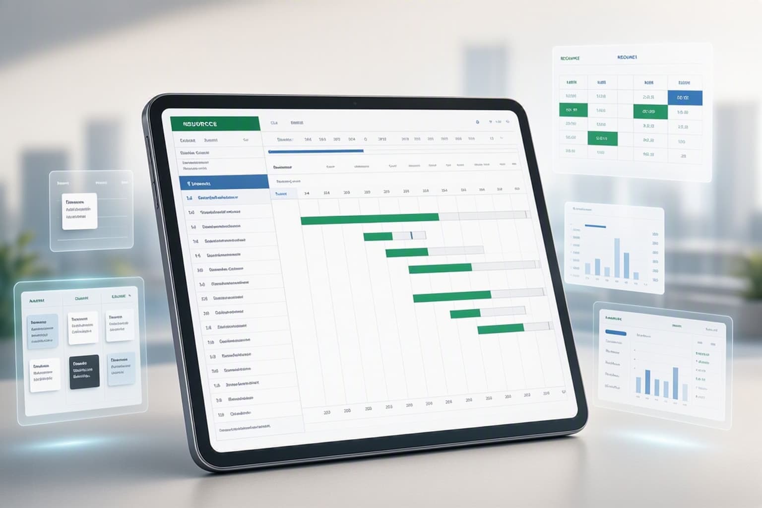
Template categories split across six functional types. Core planning templates handle straightforward task lists and milestone schedules. Methodology-specific versions support Agile sprints, waterfall phases, or Kanban workflows. Industry-tailored sheets match construction, marketing, product launches, or event planning. Advanced templates add dashboard views and conditional formatting. Executive templates focus on portfolio summaries and high-level metrics. Complete solutions bundle Gantt charts, budgets, and resource trackers in one workbook.
Excelx.com organizes its 22 free templates across these categories, making it easier to find the right starting point. ProjectManager.com offers 54 total templates, with 38 available as free Excel downloads. Smartsheet's 2026 collection emphasizes customizable layouts that adapt to different team sizes and project complexities.
Core Project Planning Templates
Simple task lists work for projects under 30 tasks with clear start and end dates. You get columns for task name, owner, due date, status, and notes. Add a completion percentage column and a conditional format rule that highlights overdue rows in red. Total setup time: five minutes.
Milestone schedules suit projects where deliverables matter more than daily tasks. Marketing campaign launches, software releases, and construction phases all benefit from milestone tracking. Templates typically include six milestone markers with target dates and amber-highlighted gate rows that require executive approval before proceeding.
Timeline views display tasks as horizontal bars across calendar weeks or months. They lack dependency logic but show overlaps and gaps at a glance. Use these for quarterly planning, content calendars, or any project where task order matters less than overall pacing.
Methodology-Specific Templates
Agile sprint planners include story point columns, sprint backlog sections, and burndown chart data. You track user stories, acceptance criteria, and velocity across two-week cycles. The template calculates remaining capacity and flags when the team commits to more points than historical velocity suggests they can complete.
Waterfall phase trackers enforce sequential stages: requirements, design, development, testing, deployment. Each phase gets a completion percentage, and the next phase stays locked until the current one reaches 100%. Conditional formatting grays out future phases until dependencies clear.
Kanban board templates divide work into columns: backlog, ready, in progress, review, done. You move tasks horizontally as they advance. Excel handles this with dropdown status fields and conditional formatting that color-codes each column. Add a work-in-progress limit formula that alerts when "in progress" exceeds your team's capacity.
Industry-Tailored Templates
Construction schedules track permits, material deliveries, subcontractor availability, and weather delays. Templates include predecessor logic so concrete pouring can't start until foundation inspection completes. Resource columns track crew assignments and equipment rentals. Budget sections link material costs to task rows.
Marketing campaign trackers organize creative briefs, approval workflows, asset delivery dates, and channel launches. You monitor email sends, social posts, ad placements, and landing page updates across a 12-week campaign. Status columns show which assets await approval, which need revisions, and which launched on schedule.
Product launch timelines coordinate engineering, design, marketing, sales, and support teams. Templates include go/no-go decision gates, beta testing phases, and post-launch monitoring periods. Cross-functional dependencies ensure marketing can't announce features until engineering marks them complete.
Event planning sheets manage venue bookings, vendor contracts, guest lists, and run-of-show schedules. Budget sections track deposits, final payments, and actual costs. Timeline views show setup days, event day activities, and teardown tasks. Resource columns assign staff to registration, catering coordination, or AV support.
Advanced and Executive Templates
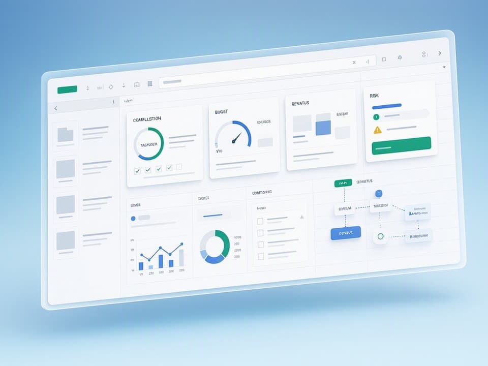
Dashboard views consolidate key metrics into a single sheet: tasks complete vs. total, budget spent vs. allocated, days remaining, risk count, milestone status. Small data tables feed charts and KPI tiles. Conditional formatting turns metrics red when thresholds breach. Executives get project health at a glance without scrolling through task lists.
Portfolio trackers manage multiple projects in one workbook. Each project gets a summary row with start date, end date, budget, status, and owner. Formulas aggregate across projects to show total budget, average completion percentage, and count of at-risk initiatives. Slicers filter by department, priority, or status.
Executive summaries pull highlights from detailed sheets: top risks, upcoming milestones, budget variances, resource bottlenecks. They update automatically when you change underlying data. Use these for steering committee meetings or monthly reports to leadership.
How to Choose the Right Free Excel Template for Your Project
Match template complexity to project size. Under 20 tasks, use a simple task list with status and due date columns. Between 20-50 tasks, add a Gantt chart view and dependency logic. Above 50 tasks, Excel starts breaking down and you need dedicated PM software or a hybrid approach.
Team structure determines collaboration needs. Solo projects or small co-located teams handle Excel fine. Distributed teams working across time zones struggle with version conflicts and manual merges. If three people edit simultaneously, you'll lose changes or spend 20 minutes reconciling versions.
Reporting frequency drives automation requirements. Weekly status meetings tolerate manual updates. Daily standups need formulas that calculate progress, flag blockers, and highlight overdue tasks automatically. Monthly executive reviews benefit from dashboard sheets that aggregate metrics without manual data entry.
Timeline complexity affects visualization needs. Straightforward sequential projects work with milestone lists. Projects with parallel workstreams and cross-team dependencies require Gantt charts with predecessor logic. Critical path analysis demands color-coded dependency chains and slack time calculations.
Budget tracking depth varies by stakeholder expectations. Internal projects may only need total cost vs. budget. Client projects require detailed cost breakdowns by category, variance explanations, and burn rate projections. Templates with SUMIFS formulas and variance alerts handle the latter without manual calculations.
Matching Template Features to Project Requirements
Run through this checklist before downloading. Does your project need task dependencies where one task can't start until another finishes? Look for predecessor columns and conditional formatting that grays out tasks until dependencies clear. Do you assign multiple resources per task? Verify the template includes resource loading columns and capacity calculations.
Budget tracking requires planned cost, actual cost, and variance columns at minimum. Better templates add cost-per-phase rollups, burn rate calculations, and conditional alerts when categories exceed budget by 10%. If you bill clients for labor hours, ensure the template links resource rates to task assignments.
Status automation saves update time. Templates should calculate completion percentage from subtask checkboxes, flag overdue tasks in red, and update milestone status when all preceding tasks finish. Manual status updates get skipped when teams get busy.
Milestone tracking matters for executive reporting. Templates need clearly marked milestone rows, target dates, actual completion dates, and variance calculations. Six milestone markers cover most projects: kickoff, design complete, development complete, testing complete, launch, and post-launch review.
Red Flags: When a Template Won't Scale
Excel breaks above 50 active tasks when you need real-time updates from multiple contributors. Version conflicts multiply, formulas get accidentally overwritten, and you spend more time merging changes than managing the project. Templates can't enforce edit permissions, so anyone can delete critical formulas.
Multiple concurrent projects in one template create navigation nightmares. Scrolling through 200 rows to find the right task wastes time. Filtering helps but doesn't solve the underlying issue that Excel wasn't designed for portfolio management at scale.
Real-time collaboration needs force you beyond Excel. If your team works across three time zones and needs instant task updates, Excel's manual save-and-share workflow causes delays. Google Sheets improves this slightly but still lacks the change tracking and conflict resolution of dedicated PM software.
Complex resource management with 15+ team members across 10+ projects requires resource leveling algorithms Excel can't provide. You can build resource loading views and flag overallocations, but rebalancing workloads manually becomes a full-time job.
Integration requirements signal you've outgrown templates. When you need to pull data from Jira, push updates to Slack, sync with accounting software, or automate client reports, Excel's lack of API connections becomes a bottleneck.
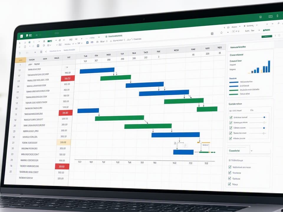
Step-by-Step: Customizing a Free Excel Gantt Chart Template
Download a Gantt chart template from Microsoft's template library or Excelx.com. Open it and immediately save a copy with your project name. Never edit the original template file.
Set your project start date in the designated cell, usually at the top of the timeline section. The template's formulas reference this cell to calculate all other dates. Change the date format to match your region if needed.
Replace placeholder task names with your actual work breakdown structure. Start with major phases, then add tasks under each phase. Most templates support three levels: phase, task, subtask. Indent subtasks by one column to show hierarchy.
Define dependencies in the predecessor column. Enter the row number of the task that must finish before this one starts. The template's conditional formatting will gray out tasks until their predecessors complete. For tasks with multiple predecessors, separate row numbers with commas.
Adjust the timeline view to match your project duration. If the template shows 12 weeks but you need 6 months, modify the column headers and adjust the conditional formatting date ranges. The timeline bars use formulas that compare task start and end dates to column header dates, shading cells that fall within the task duration.
Setting Up Your Task Structure and Dependencies
Organize tasks using a work breakdown structure. Level 1 rows represent major phases like "Planning," "Execution," and "Closeout." Level 2 rows under each phase list specific deliverables. Level 3 rows break deliverables into actionable tasks.
Parent-child relationships appear through indentation. Parent tasks roll up duration and completion from child tasks. Use SUMIFS formulas to aggregate child task hours into parent rows. Completion percentage for parents should average child completion, weighted by task size.
Predecessor logic lives in a dedicated column. Enter the row number of tasks that must finish first. For finish-to-start dependencies (most common), the current task can't begin until the predecessor reaches 100% complete. Templates use IF formulas to check predecessor status before allowing work to start.
Lag time between tasks requires an additional column. If concrete needs 48 hours to cure before framing starts, add a 2-day lag to the framing task. The template adjusts the start date calculation to account for the delay.
Critical path identification separates must-have tasks from nice-to-haves. Highlight the longest sequence of dependent tasks in red. These tasks have zero slack, any delay pushes the final deadline. Non-critical tasks show slack time and can shift without affecting the end date.
Building Timeline Visualization with Conditional Formatting
Timeline bars use cell background colors to show task duration across calendar periods. The formula checks if the column's date falls between the task's start and end dates. If true, shade the cell blue. If false, leave it white.
The core formula looks like: =AND(ColumnDate>=$StartDate,ColumnDate<=$EndDate). Apply this as a conditional formatting rule to the entire timeline range. Replace ColumnDate, StartDate, and EndDate with actual cell references.
Progress shading adds a second layer. Partial completion shows as a different color. If a task is 50% complete, the first half of its timeline bar turns green while the second half stays blue. This requires a more complex formula that calculates the midpoint date: =$StartDate+(($EndDate-$StartDate)*$CompletionPercent).
Milestone markers appear as diamonds or vertical lines on the timeline. Use a different conditional format rule that checks if the column date matches the milestone date exactly. Apply a custom format or insert a shape character.
Overdue highlighting turns past-due tasks red. Add a rule that checks if today's date exceeds the end date and completion is less than 100%. Use =AND(TODAY()>$EndDate,$Completion<1) as the condition.
Adding Formulas for Automatic Duration and Status Tracking
DATEDIF calculates task duration in days: =DATEDIF(StartDate,EndDate,"D"). This updates automatically when you change start or end dates. Add 1 to include both the start and end day in the count.
SUMIFS aggregates progress across filtered tasks. To show total completion for a phase, use: =SUMIFS(CompletionRange,PhaseRange,ThisPhase,StatusRange,"Active"). This sums completion percentages only for active tasks in the current phase.
IF/AND formulas drive status flags. Mark tasks "At Risk" when they're less than 50% complete but more than 50% through their timeline: =IF(AND(Completion<0.5,(TODAY()-StartDate)/(EndDate-StartDate)>0.5),"At Risk","On Track"). Conditional formatting colors these cells amber.
NETWORKDAYS calculates working days between dates, excluding weekends and holidays. Use this for realistic duration estimates: =NETWORKDAYS(StartDate,EndDate,HolidayRange). Define a holiday list on a separate sheet and reference it.
VLOOKUP pulls resource data into task rows. If you maintain a resource sheet with names and hourly rates, use: =VLOOKUP(ResourceName,ResourceTable,RateColumn,FALSE). Multiply this rate by task hours to calculate labor cost.
Building a Project Budget Tracker in Excel from a Free Template
Start with a budget template that includes planned cost, actual cost, and variance columns for each budget category. Common categories: labor, materials, equipment, subcontractors, travel, contingency. Add rows under each category for line items.
Enter planned costs based on estimates or quotes. Labor costs come from resource rates multiplied by estimated hours. Material costs come from vendor quotes. Equipment costs include rentals and purchases. Subcontractor costs pull from fixed-price contracts.
Track actual costs as invoices arrive and timesheets get submitted. Update the actual cost column weekly. Variance calculates automatically: =ActualCost-PlannedCost. Positive variance means overspend. Conditional formatting highlights variances exceeding 10% in red.
Burn rate shows how fast you're spending. Calculate monthly burn: =SUMIFS(ActualCostRange,DateRange,">="&FirstDayOfMonth,DateRange,"<="&LastDayOfMonth). Compare this to planned monthly spend. If you're burning 30% faster than planned, you'll exhaust the budget before project completion.
Forecasted final cost projects total spend based on current trends. Use: =ActualCostToDate+(PlannedTotalCost-PlannedCostToDate)*(ActualCostToDate/PlannedCostToDate). This assumes your current cost performance continues. If you're 20% over budget at 50% completion, you'll likely finish 20% over budget overall.
Essential Budget Formulas and Cost Tracking Logic
SUMIFS aggregates costs by category: =SUMIFS(CostRange,CategoryRange,"Labor"). This totals all labor line items regardless of where they appear in the sheet. Use this for category rollup rows and dashboard metrics.
Percentage variance shows overspend or underspend relative to budget: =(ActualCost-PlannedCost)/PlannedCost. Format as percentage. A result of 0.15 means 15% over budget. Conditional formatting turns cells red above 10% and green below -5%.
Conditional alerts flag problem categories. Use: =IF(VariancePercent>0.1,"Review Required",""). This populates a status column with alerts when variance exceeds thresholds. Sort by this column to prioritize budget discussions.
Committed costs track purchase orders and contracts not yet invoiced. Add a committed column between planned and actual. Forecasted spend becomes: =ActualCost+CommittedCost+(PlannedCost-ActualCost-CommittedCost). This gives a more accurate projection than actual costs alone.
Cost-per-phase breakdowns show where money goes. If your project has five phases, use SUMIFS to total costs where the phase column matches each phase name. Compare phase costs to phase budgets to identify which stages run over.
Linking Budget Data to Your Gantt Chart or Task List
VLOOKUP pulls resource rates from a separate resource sheet into task rows. Set up a resource table with columns for name, role, and hourly rate. In your task sheet, use: =VLOOKUP(ResourceName,ResourceTable,3,FALSE) to fetch the rate. Multiply by estimated hours to get task labor cost.
Cross-sheet references connect budget and schedule data. If your budget lives on Sheet1 and your Gantt chart on Sheet2, reference budget cells like: =Sheet1!B15. This pulls the labor budget total into a Gantt chart summary section.
Unified project views combine schedule and budget in one dashboard. Create a summary sheet with key metrics: total budget, spent to date, remaining budget, completion percentage, days remaining. Use formulas that reference both budget and schedule sheets. Add a small chart showing budget vs. actual over time.
Task-level cost tracking requires a cost column in your Gantt chart. Calculate each task's cost from resource assignments and material needs. Sum these to get total project cost. Compare to your budget tracker's total to ensure consistency.
Variance analysis links schedule delays to cost overruns. If a task runs two weeks late, overtime costs increase. Add a formula that multiplies delay days by resource rates and an overtime multiplier. This shows the financial impact of schedule slippage.
Using Excel Templates for Resource Allocation and Capacity Planning
Resource allocation templates track who works on what and when. Create a matrix with team members as rows and time periods (weeks or months) as columns. Fill cells with allocated hours for each person per period.
Capacity calculations compare allocated hours to available hours. If someone works 40 hours weekly and you've allocated 45, they're overallocated by 5 hours. Use conditional formatting to highlight overallocations in red.
Task assignment links back to your Gantt chart. Each task lists required resources and estimated hours. Pull this data into your resource allocation matrix using SUMIFS: =SUMIFS(HoursRange,ResourceRange,ThisPerson,WeekRange,ThisWeek). This aggregates all hours assigned to one person in one week across all tasks.
Availability tracking accounts for vacations, holidays, and other projects. Reduce available hours for periods when team members are out. If someone takes a week off, their available hours for that week drop to zero.
Workload distribution shows whether work spreads evenly or clusters. A bar chart of allocated hours per person reveals if two people carry 70% of the load while three others stay underutilized. Rebalance assignments to smooth the distribution.
Creating a Resource Loading View
Matrix layout puts resources on the vertical axis and time periods on the horizontal axis. Each cell shows allocated hours for that person in that period. Add a total row at the bottom and a total column on the right.
Capacity vs. demand calculations happen in two rows per person. Row 1 shows allocated hours (demand). Row 2 shows available hours (capacity). Row 3 calculates the difference: =Capacity-Demand. Negative values indicate overallocation.
Color-coding makes problems visible instantly. Use conditional formatting with three rules: green when demand is 0-80% of capacity, amber when 80-100%, red when over 100%. This creates a heat map of resource strain.
Rolling forecasts extend the view beyond the current week. Show the next 12 weeks to identify future bottlenecks. If you see red cells three weeks out, you have time to rebalance assignments or hire contractors.
Scenario planning adds rows for proposed hires or contractors. Show current state, then add "what-if" rows that include additional capacity. Recalculate the demand vs. capacity difference to see if the new resources solve overallocation problems.
Spotting Bottlenecks with Conditional Formatting
Overallocation rules highlight cells where allocated hours exceed available hours. Use: =AllocatedHours>AvailableHours as the condition. Apply red fill to these cells. Scan the matrix for red cells to find bottlenecks.
Conflict flags appear when one person is assigned to two tasks in the same time period with insufficient capacity. Add a helper column that counts how many tasks overlap for each person per week. If the count exceeds 1 and total hours exceed capacity, flag it.
Workload distribution charts show allocation patterns over time. Create a stacked bar chart with one series per person. Tall bars indicate heavy workload periods. Flat sections show underutilization. Aim for consistent bar heights across weeks.
Critical resource identification marks people whose absence would stall the project. If only one person has a required skill and they're allocated at 100% capacity, they're a critical resource. Highlight their row in a distinct color and plan backup options.
Skill gap analysis compares required skills to available skills. If a task needs Python expertise but no team member has it, you have a gap. Add a skills matrix on a separate sheet and use VLOOKUP to check whether assigned resources have required skills.
Advanced Excel Features to Enhance Free Project Templates
Pivot tables summarize task data by status, owner, phase, or priority. Select your task list, insert a pivot table, drag fields to rows and values areas. Count tasks by status to see how many are complete, in progress, or not started. Refresh the pivot when underlying data changes.
Slicers add interactive filtering to pivot tables and charts. Insert a slicer for the status field. Click "In Progress" and your charts update to show only active tasks. Slicers work across multiple pivot tables if you connect them.
Data validation creates dropdown lists for status, priority, and owner columns. This prevents typos and ensures consistency. Define a list of valid values on a separate sheet, then use Data > Data Validation > List to restrict entries.
Named ranges make formulas readable. Instead of =SUMIFS(D2:D50,B2:B50,"Complete"), use =SUMIFS(CompletionHours,Status,"Complete"). Define named ranges via Formulas > Define Name. This also makes formulas easier to audit and debug.
Dashboard views consolidate metrics from multiple sheets. Create a new sheet called Dashboard. Use formulas to pull key numbers: total tasks, completion percentage, budget spent, days remaining. Add small charts and conditional formatting to create an executive summary.
Building a Project Dashboard with Summary Metrics
KPI tiles display single numbers with context. Create a cell with a large font showing "78%" for completion percentage. Below it in smaller text, add "23 of 30 tasks complete." Use borders to create a tile effect. Arrange 4-6 tiles across the top of your dashboard.
Task completion metrics come from counting completed vs. total tasks: =COUNTIF(StatusRange,"Complete")/COUNTA(StatusRange). Format as percentage. Add a small bar chart below the number showing progress visually.
Budget spent calculations pull from your budget sheet: =SUM(ActualCostRange). Display this as a percentage of total budget: =BudgetSpent/TotalBudget. Use a gauge chart or progress bar to show how much budget remains.
Days remaining subtracts today's date from the project end date: =EndDate-TODAY(). Add context by showing percentage of timeline elapsed: =(TODAY()-StartDate)/(EndDate-StartDate). If you're 70% through the timeline but only 50% complete, you're behind schedule.
Risk count aggregates high-priority risks or blockers: =COUNTIF(RiskLevel,"High"). Display this prominently. Add a small table below showing the top 3 risks by impact. Use conditional formatting to highlight risks that increased since last week.
Automating Status Updates with Formulas and Rules
Conditional logic sets RAG (Red-Amber-Green) status automatically. Use: =IF(CompletionPercent>=0.9,"Green",IF(CompletionPercent>=0.7,"Amber","Red")). Apply conditional formatting that colors cells to match the status value.
Overdue flags appear when end date passes without 100% completion: =IF(AND(TODAY()>EndDate,Completion<1),"OVERDUE",""). Use bold red text format for this
Get the newsletter
One sharp idea every Sunday.
No fluff. No sales pitches. Just the best of what we publish, hand-picked.
Continue Reading
Related Articles
2026 Excel Payroll Templates: Ultimate Guide & Free Downloads
Running payroll in Excel still works in 2026. Small business owners with 2-10 employees, HR teams managing seasonal workers, and freelancers paying contractors rely on payroll spreadsheet templates to...

13+ Free Sales Tracker Excel Templates for 2026
A sales tracker Excel template gives you a single place to log prospects, track deal stages, forecast revenue, and spot bottlenecks without paying monthly CRM fees. It works as a structured spreadshee...

10+ Free Employee Attendance Tracker Excel Templates for 2026
Small businesses waste thousands of hours each year tracking attendance manually or patching together inconsistent spreadsheets. An employee attendance tracker Excel template gives you a structured, f...