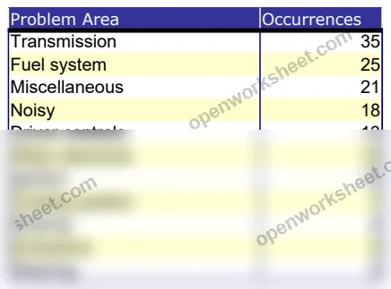
Problem Analysis with Pareto Chart
Identify critical issues using Pareto analysis and visual chart to prioritize problem-solving efforts.
This template organizes problem data by occurrence frequency and displays it in a Pareto chart to reveal which issues account for the majority of problems. Track problem areas and their frequency, then visualize the distribution to focus resources on high-impact improvements. Perfect for quality control, process improvement, and operations teams who need to identify root causes and prioritize solutions systematically.
What's inside
- Problem occurrence data entry
- Automatic Pareto chart visualization
- 80/20 rule identification
- Sortable data by frequency
- Visual trend analysis
Download this and everything else
.xlsx · 2 sheets · includes charts
$29$9once for thousands of templates. No subscription.
- Limited-time offer, normally $29
- One payment, no subscription
- 14-day refund
More in Data Analysis & Visualization
 Data Analysis & Visualization
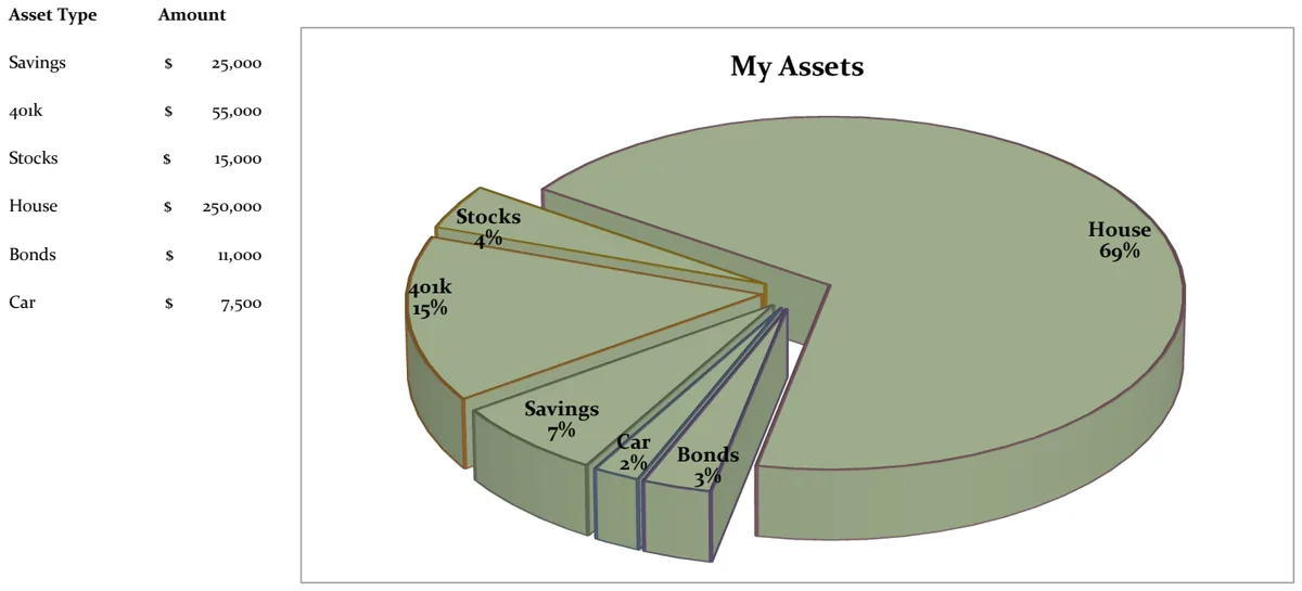
21st Century Asset Allocation Pie Chart
Visualize your net worth distribution across asset types with an interactive pie chart.
- Automatic pie chart generation
- Asset type and amount input fields
- Dynamic percentage calculations
 Data Analysis & Visualization
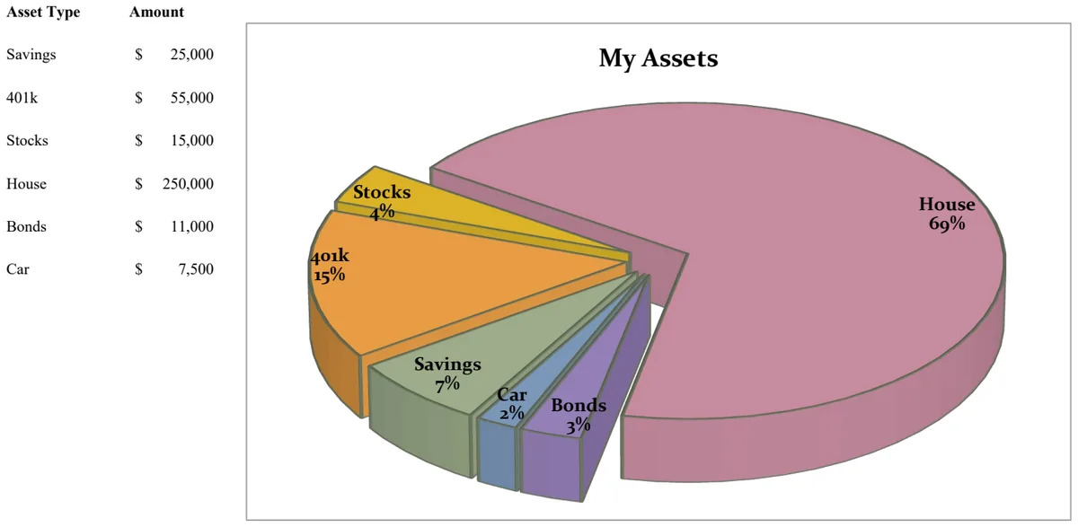
21st Century Pie Chart - Asset Breakdown
Visualize your asset allocation across savings, investments, and retirement accounts with an interactive pie chart.
- Pie chart visualization of asset distribution
- Asset type categorization
- Amount tracking by asset class
 Data Analysis & Visualization
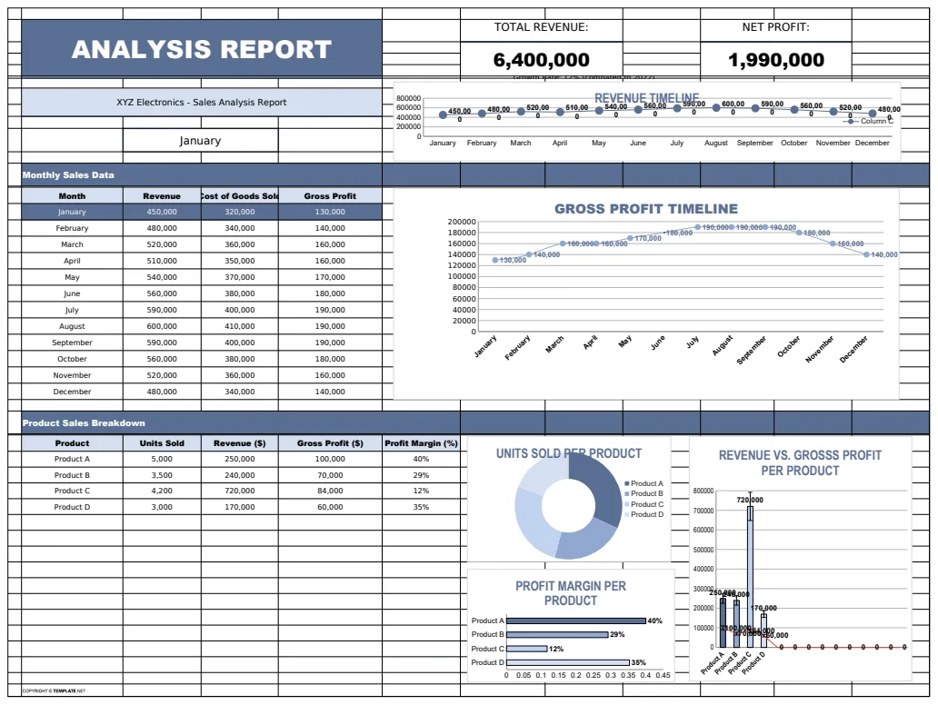
Analysis Report Template
A comprehensive analysis report template for tracking and visualizing business metrics like revenue and profit.
- Revenue tracking
- Profit calculation
- Error handling with IFERROR
 Data Analysis & Visualization
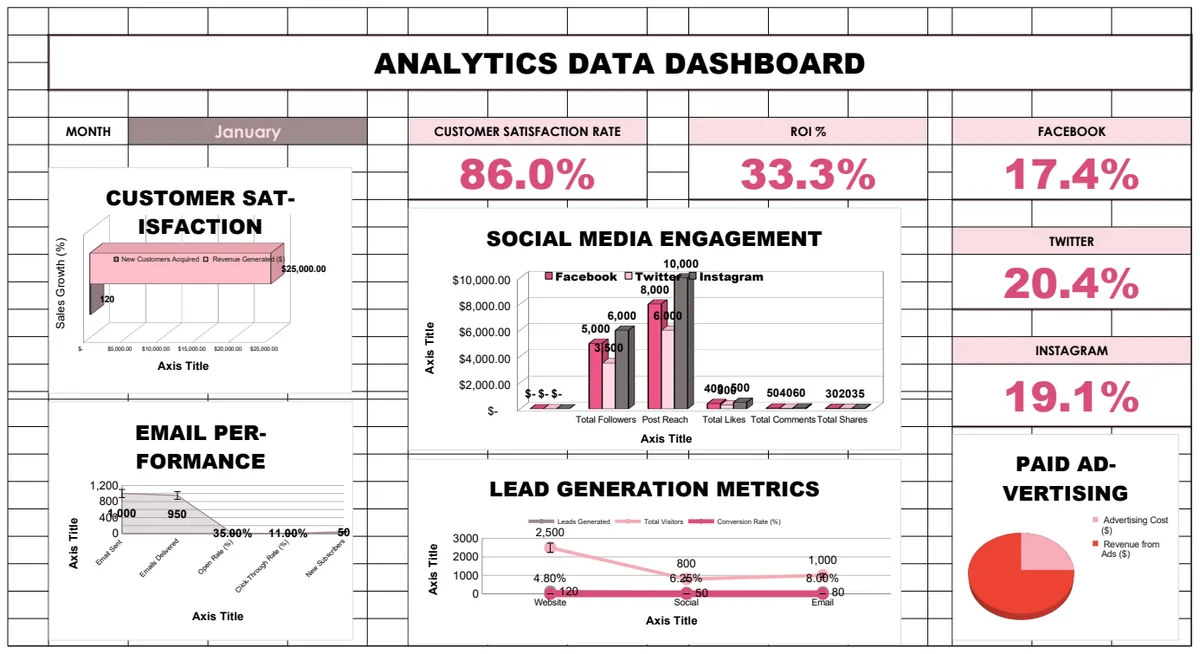
Analytics Data Dashboard
Comprehensive business analytics dashboard tracking customer satisfaction, sales performance, social media engagement, email campaigns, and lead generation metrics with interactive charts and KPI visualizations.
- Pre-built KPI calculations with formulas
- Multi-sheet analytics for different channels
- Social media engagement tracking