
T Chart
Visually compare pros and cons side-by-side to evaluate decisions and analyze arguments objectively.
A T Chart is a simple two-column decision-making tool that helps you organize and compare the advantages and disadvantages of any topic, decision, or argument. It provides a clear visual structure for listing pros on one side and cons on the other, making it easy to weigh options fairly and identify the strongest points on each side. Use this template when evaluating business decisions, analyzing proposals, conducting debates, or teaching critical thinking. It removes bias by forcing systematic consideration of both perspectives and creates an objective foundation for informed choices.
What's inside
- Two-column layout for pros and cons
- Clean, simple structure
- Easy to fill in and share
- Supports objective decision-making
Download this and everything else
.xlsx · 1 sheet
$29$9once for thousands of templates. No subscription.
- Limited-time offer, normally $29
- One payment, no subscription
- 14-day refund
More in Data Analysis & Visualization
 Data Analysis & Visualization
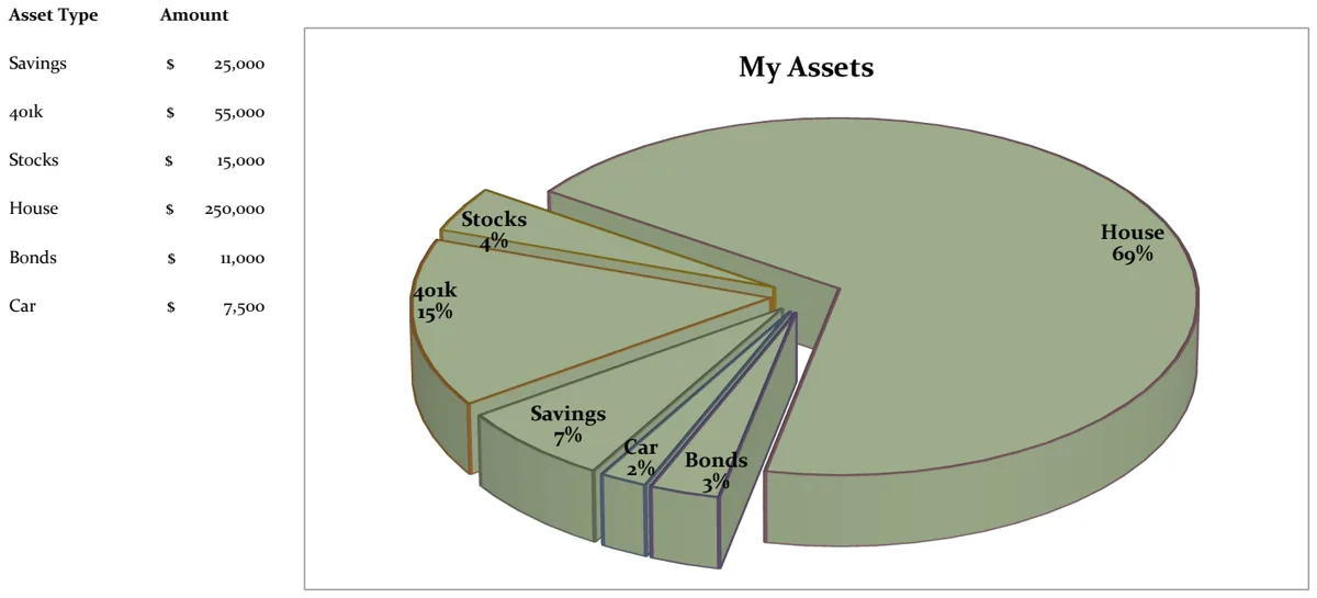
21st Century Asset Allocation Pie Chart
Visualize your net worth distribution across asset types with an interactive pie chart.
- Automatic pie chart generation
- Asset type and amount input fields
- Dynamic percentage calculations
 Data Analysis & Visualization
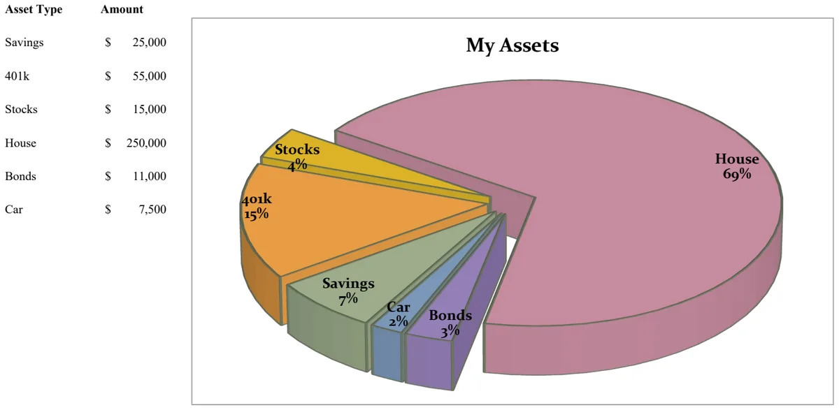
21st Century Pie Chart - Asset Breakdown
Visualize your asset allocation across savings, investments, and retirement accounts with an interactive pie chart.
- Pie chart visualization of asset distribution
- Asset type categorization
- Amount tracking by asset class
 Data Analysis & Visualization
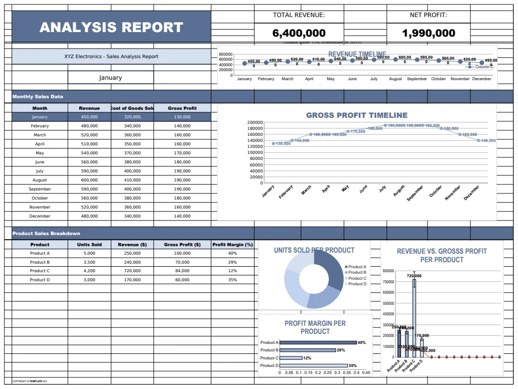
Analysis Report Template
A comprehensive analysis report template for tracking and visualizing business metrics like revenue and profit.
- Revenue tracking
- Profit calculation
- Error handling with IFERROR
 Data Analysis & Visualization
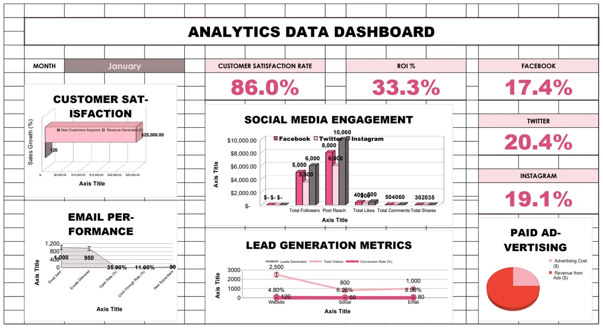
Analytics Data Dashboard
Comprehensive business analytics dashboard tracking customer satisfaction, sales performance, social media engagement, email campaigns, and lead generation metrics with interactive charts and KPI visualizations.
- Pre-built KPI calculations with formulas
- Multi-sheet analytics for different channels
- Social media engagement tracking