5 essential HR metrics for your Excel dashboard
Learn how to create a functional HR dashboard in Excel using essential metrics and a free template.
Many people believe a truly functional hr dashboard template Excel free requires extensive customization or advanced Excel skills. The reality is that many core HR metrics can be visualized effectively with pre-built templates and a solid understanding of your data. Getting started doesn't demand hours of formula building; it hinges on identifying the right data points and presenting them clearly.
A well-designed HR dashboard consolidates critical information, offering a snapshot of your workforce's health and operational efficiency. It moves beyond scattered spreadsheets to provide actionable insights at a glance. Whether you're tracking employee turnover, recruitment funnels, or training completion rates, the right template can transform raw data into strategic intelligence.
Core HR Metrics to Track
Before diving into template specifics, consider what data actually matters for your organization. A good starting point includes metrics that inform staffing decisions, operational costs, and employee engagement.
- Headcount: The total number of employees. This is fundamental for resource allocation and understanding organizational size.
- Employee Turnover Rate: The percentage of employees leaving the company over a specific period. High turnover can signal underlying issues and incurs significant replacement costs.
- Time to Hire: The average number of days it takes to fill an open position. This metric impacts productivity and can highlight recruitment bottlenecks.
- Cost Per Hire: The total expenses associated with recruiting a new employee, divided by the number of hires. This helps assess the efficiency of your recruitment budget.
- Employee Absenteeism Rate: The percentage of scheduled workdays missed by employees. High rates can point to morale issues or health concerns.
- Training Hours Per Employee: The average amount of training time each employee receives. This tracks investment in professional development.
- Employee Satisfaction/Engagement Scores: Data from surveys that gauge how engaged and satisfied your workforce is.
Building Your Dashboard in Excel
Excel offers powerful tools for creating dynamic HR dashboards. While a pre-built hr dashboard template Excel free is a great starting point, understanding the underlying structure is key to adapting it.
Data Preparation is Key
Your dashboard is only as good as the data feeding it. Ensure your source data is clean, consistent, and organized. This typically means having a primary data sheet with columns for each relevant attribute. For example, if you're tracking employee departures, your source data might include:
- Employee ID
- Hire Date
- Termination Date
- Department
- Job Title
- Reason for Leaving
Leveraging PivotTables and PivotCharts
PivotTables are Excel's workhorses for summarizing and analyzing data. They allow you to quickly aggregate your raw HR data into meaningful statistics without complex formulas.
- 01Select your data range: Highlight all the cells containing your HR data.
- 02Insert PivotTable: Go to the "Insert" tab and click "PivotTable." Choose where to place the PivotTable (new worksheet is usually best).
- 03Arrange fields: In the PivotTable Fields pane, drag and drop your data fields into the "Rows," "Columns," "Values," and "Filters" areas. For instance, to count employees by department, drag "Department" to "Rows" and "Employee ID" (or any unique identifier) to "Values," ensuring it's set to "Count."
- 04Create PivotCharts: Once your PivotTable is set up, select it and go to the "Analyze" tab (or "Insert" tab in older versions) and click "PivotChart." Choose the chart type that best visualizes your data (e.g., bar charts for comparisons, line charts for trends).
Using Formulas for Calculations
Beyond PivotTables, specific Excel formulas can enhance your dashboard.
- `COUNTIFS` / `SUMIFS`: These are invaluable for conditional counting and summing. For example, to count employees in a specific department who were hired after a certain date, you'd use
COUNTIFS(DepartmentRange, "Sales", HireDateRange, ">=" & DATE(2023,1,1)). - `AVERAGEIFS`: Similar to
SUMIFSbut for calculating averages based on multiple criteria. Useful for finding average time to hire for specific roles. - `DATEDIF`: Calculates the difference between two dates in years, months, or days. This is perfect for calculating employee tenure or days since a specific event.
- `XLOOKUP`: A modern and flexible function for looking up values in a table. It can replace older
VLOOKUPorHLOOKUPfunctions and is essential for pulling specific employee details or metric definitions into your dashboard.
Essential Dashboard Components
A practical HR dashboard should include a mix of summary statistics, trend indicators, and potentially alerts.
Visualizations
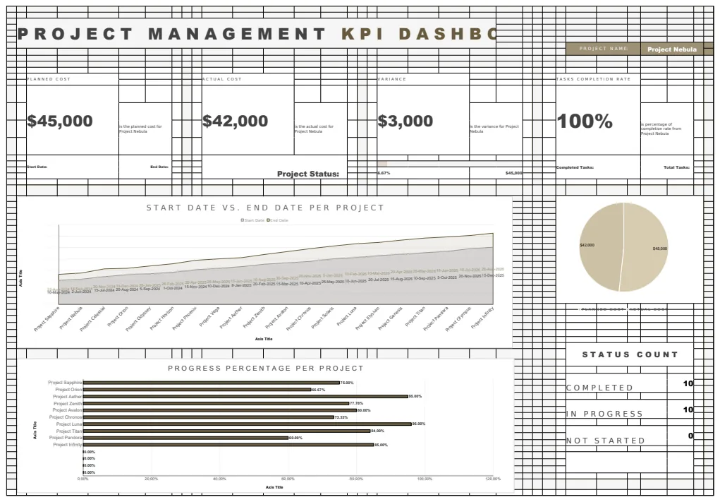
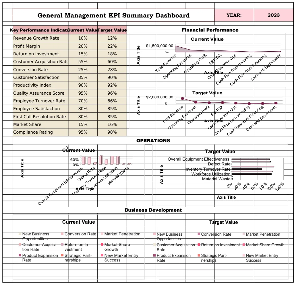
- Key Performance Indicators (KPIs): Large, clear numbers showing your most critical metrics (e.g., current headcount, current turnover rate).
- Trend Charts: Line graphs showing how metrics like turnover or time to hire have changed over time (monthly or quarterly).
- Breakdown Charts: Bar or pie charts illustrating distributions, such as employee distribution by department, age group, or job level.
- Funnel Charts: Useful for visualizing recruitment pipelines, showing candidate progression through stages.
Interactive Elements
- Slicers and Timelines: These are visual filters that allow users to quickly drill down into specific data subsets without manually adjusting PivotTable filters. They make your dashboard interactive and user-friendly.
- Dropdown Menus: For selecting specific departments, job titles, or time periods to analyze.
Example: Tracking Employee Turnover
Let's walk through setting up a basic employee turnover tracker.
Source Data (Sheet: "EmployeeData")
| Employee ID | Hire Date | Termination Date | Department | Reason for Leaving | | :---------- | :--------- | :--------------- | :--------- | :----------------- | | 1001 | 2022-01-15 | | Sales | | | 1002 | 2021-07-22 | 2023-03-10 | Marketing | Resignation | | 1003 | 2023-02-01 | | Engineering| | | 1004 | 2020-11-05 | 2023-01-20 | Sales | Performance | | 1005 | 2022-05-30 | | HR | |
Dashboard Setup (Sheet: "Dashboard")
- 01Calculate Total Employees: In a cell (e.g., B2), use
=COUNT(EmployeeData!A:A)-1(subtract 1 for the header row). Label this "Total Employees." - 02Calculate Active Employees: This is trickier if you don't have a status column. A common method is to count employees with a Hire Date but no Termination Date. Assuming your "Termination Date" column is E, you could use:
=COUNTIFS(EmployeeData!A:A, "<>"&"", EmployeeData!E:E, ""). Label this "Active Employees." - 03Calculate Terminated Employees:
=COUNT(EmployeeData!E:E)-1(assuming column E is Termination Date). Label this "Terminated Employees." - 04Calculate Turnover Rate (Year-to-Date): This requires defining a period. Let's say we want YTD turnover.
- First, count employees terminated this year:
=COUNTIFS(EmployeeData!E:E, ">="&DATE(YEAR(TODAY()),1,1), EmployeeData!E:E, "<="&TODAY()). - Then, calculate the average number of employees during the period (this is an approximation, a more accurate calculation involves monthly averages). A simpler approach for a dashboard is often to use the current number of active employees as the denominator, or a historical average. For a quick YTD rate:
=[Count of Terminated YTD] / [Active Employees]. Format as a percentage.
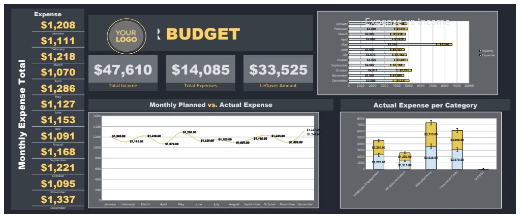
This basic setup provides immediate insights. For a more comprehensive view, you might want to incorporate monthly turnover trends using PivotTables that filter by termination date. You could also adapt this approach to create an HR Budget Dashboard Template by tracking salary expenses, benefits costs, and recruitment spending against allocated budgets.
Common Pitfalls to Avoid
- Overly Complex Formulas: Sticking to simpler, understandable formulas or leveraging PivotTables will make your dashboard easier to maintain and troubleshoot.
- Data Inconsistency: Without clean and standardized source data, your dashboard will display inaccurate information. Implement data validation in your source sheets.
- Too Much Information: A dashboard should be a summary. Cramming every possible metric onto one screen can be overwhelming and dilute the impact of key insights. Prioritize ruthlessly.
- Lack of Context: Ensure your metrics are presented with clear labels and, where necessary, comparisons to previous periods or targets. A turnover rate of 15% means little without knowing if that's good or bad for your industry or historical performance.
- Ignoring the Audience: Who will use this dashboard? Tailor the metrics and their presentation to the needs of HR managers, executives, or department heads.
Frequently Asked Questions
Can I create a truly dynamic HR dashboard for free in Excel?
Yes, absolutely. Excel's built-in features like PivotTables, PivotCharts, and functions like SUMIFS and COUNTIFS are powerful enough for dynamic reporting. You don't need expensive add-ins for many common HR tracking needs. A hr dashboard template Excel free from a reputable source can provide a solid foundation you can then customize.
How do I handle employee data privacy on a dashboard?
This is critical. Never include personally identifiable information (PII) like full names, addresses, or social security numbers directly on a dashboard view. Use anonymized IDs. For sensitive details, restrict access to the underlying source data or specific reports. Ensure your dashboard design complies with relevant data protection regulations.
What if my HR data is spread across multiple systems?
If your data isn't in one place, you'll need to consolidate it first. This might involve exporting data from different HRIS, payroll, or time-tracking systems into a single Excel workbook. You can then use Power Query (available in modern Excel versions) to automate the process of importing and cleaning data from various sources, making your dashboard updates much more efficient. This consolidation step is crucial before you can effectively build any kind of hr dashboard template Excel free.
How often should I update my HR dashboard?
The frequency depends on the metric and the needs of your organization. Core metrics like headcount and immediate recruitment numbers might be updated daily or weekly. Trend data for turnover, time to hire, or training hours might be best reviewed monthly or quarterly. Automating data refreshes, where possible, ensures you're always working with the most current information.