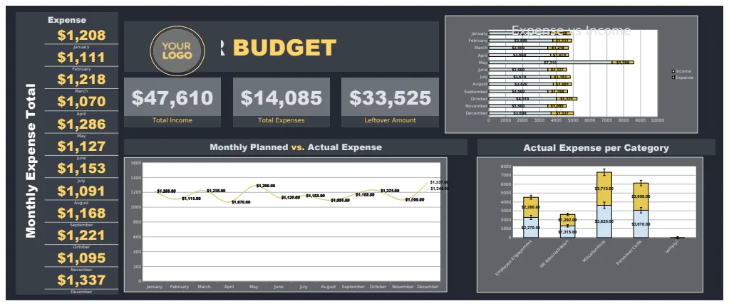
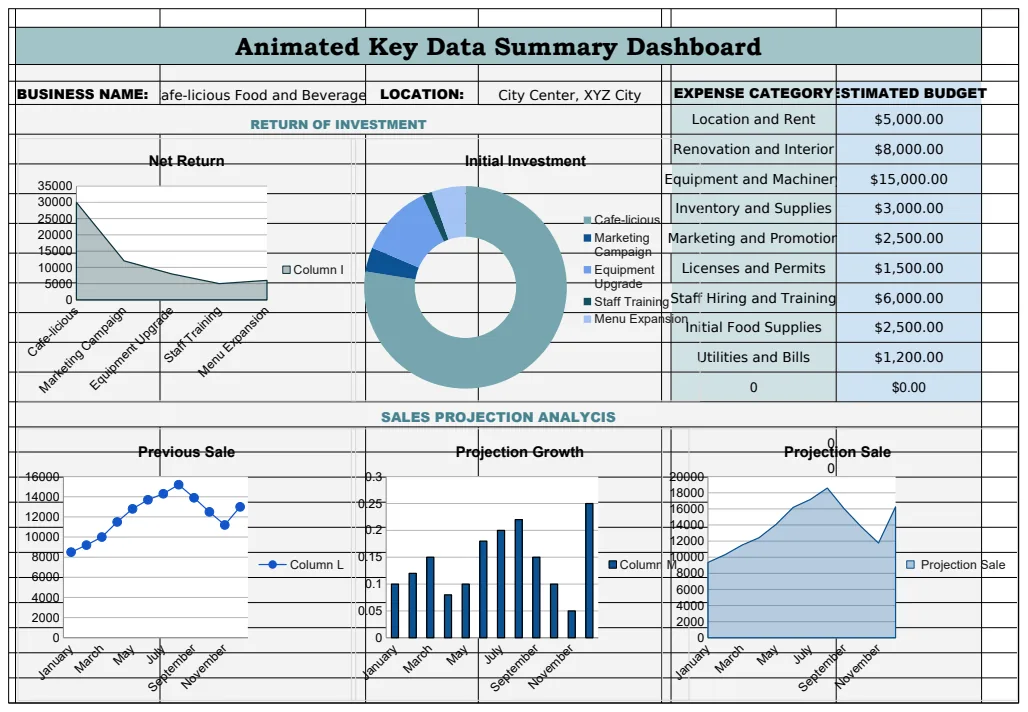
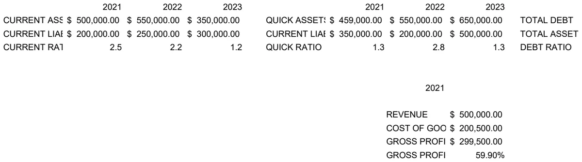
Track your business goals with a free Excel KPI dashboard
Learn how to find and use a dynamic kpi dashboard template Excel free to effectively track your business goals and drive better decisions.
A common misconception is that a "kpi dashboard template Excel free" must be a static, unchangeable file. In reality, the best free templates are dynamic, allowing you to plug in your own data and see it update instantly. You can absolutely find a robust kpi dashboard template Excel free that will give you immediate insights.
This article will guide you through setting up and using such a template effectively, focusing on the practical steps and common pitfalls. We’ll explore how to adapt a template to your specific needs, ensuring your key performance indicators (KPIs) are not just tracked, but actively drive better decision-making.
Understanding What Makes a Dashboard "Dynamic"
A truly useful dashboard template goes beyond just presenting numbers. It should allow for easy data input and automatically reflect changes across all charts and tables. This usually involves:
- Structured Data Input Sheets: Separate sheets where you enter raw data, typically in a tabular format with clear column headers.
- Formulas and Functions: Extensive use of Excel functions like
SUMIFS,AVERAGEIFS,VLOOKUP,XLOOKUP,INDEX/MATCH, and potentially array formulas to pull and aggregate data from your input sheets. - Charts and Graphs: Visualizations that are linked to the aggregated data, updating automatically when the input data changes.
- Slicers and Dropdowns: Interactive elements that allow you to filter data by date range, department, product, or other categories, dynamically changing the dashboard's view.
Without these elements, you're essentially looking at a pre-filled spreadsheet, not a functional dashboard.
Setting Up Your Data Input Sheet
The foundation of any dynamic dashboard is clean, well-organized data. When you download a kpi dashboard template Excel free, it will likely come with a placeholder data sheet. Your first task is to replace this with your actual business data.
Consider the following column structure for a general sales KPI dashboard:
- Date: The date of the transaction or record. This is crucial for time-series analysis.
- Region: The geographical area where the sale occurred.
- Salesperson: The individual who made the sale.
- Product Category: The type of product sold.
- Product Name: The specific product sold.
- Units Sold: The quantity of the product sold.
- Revenue: The total revenue generated from the sale.
- Cost of Goods Sold (COGS): The direct costs associated with the products sold.
- Customer Type: e.g., New, Existing, Wholesale.
Ensure your date column is formatted as dates, and numerical columns are formatted as numbers or currency. Consistent formatting prevents errors in calculations.
Adapting Existing Templates to Your KPIs
You might download a template that tracks metrics slightly different from your core KPIs. For example, you might need to track "Customer Acquisition Cost" (CAC) alongside "Revenue."
Here's a general approach to adapt a template:
- 01Identify the Core Data: Understand which columns in your input sheet feed into the existing charts and tables.
- 02Add New Columns: If necessary, add new columns to your input sheet for any new data points you need to track (e.g., Marketing Spend, Customer Lifetime Value).
- 03Modify Aggregation Formulas: Locate the formulas that pull data for the dashboard charts. You'll likely need to adjust
SUMIFS,AVERAGEIFS, orXLOOKUPformulas to include your new data or calculate new metrics. For instance, to calculate CAC, you might need a formula like:=SUM(MarketingSpend)/COUNTUNIQUE(NewCustomers). This requires having columns for "Marketing Spend" and a way to identify unique new customers. - 04Update Chart Data Ranges: If you've added new rows or columns, you may need to adjust the data source range for your charts. Right-click a chart, select "Select Data," and update the ranges to include your new data.
- 05Add New Visualizations: If the template doesn't have charts for your new KPIs, you can create them. Select your aggregated data and use Excel's "Insert Chart" feature.
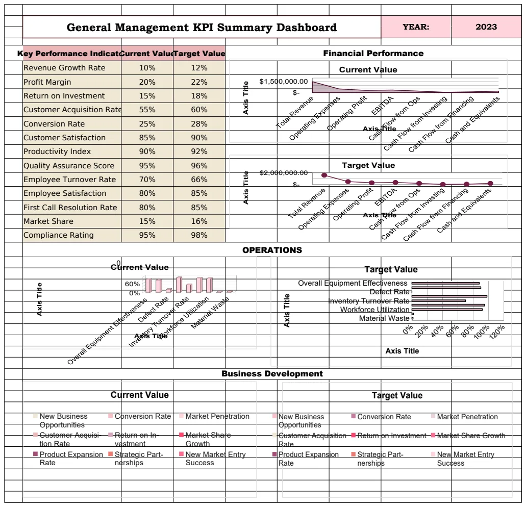
For businesses focused on overall performance, a template like the General Management KPI Dashboard Template can be a great starting point, often adaptable to specific departmental needs.
Using Slicers and Filters for Deeper Analysis
Interactive elements are what elevate a simple spreadsheet into a powerful analytical tool. Slicers and dropdowns allow for quick filtering without complex formula adjustments.
- Slicers: These are visual buttons that you can click to filter data. They are particularly effective for filtering tables and PivotTables. To add slicers to charts and tables, select a chart or PivotTable, go to the "Analyze" or "Insert" tab, and choose "Insert Slicer." You can then connect the slicer to multiple tables and charts.
- Dropdown Lists (Data Validation): You can create dropdown lists in cells using Data Validation. This is useful for selecting criteria like a specific month, year, or department. Go to Data > Data Validation, choose "List" from the Allow dropdown, and enter your list items in the Source box, separated by commas, or reference a range of cells.
By using slicers for "Region" and dropdowns for "Year," you can quickly see how sales for a specific product category performed in the "North" region during "2025."
Common Mistakes to Avoid
When working with a kpi dashboard template Excel free, several common mistakes can undermine its effectiveness:
- Overly Complex Formulas: While powerful, overly complex nested formulas can become difficult to troubleshoot. Break down complex calculations into intermediate steps in separate cells or columns.
- Inconsistent Data Formatting: Dates entered as text, currency symbols within number fields, or inconsistent spelling of categories (e.g., "NY" vs. "New York") will break formulas and aggregations. Always clean your data first.
- Ignoring Data Granularity: Ensure your input data has sufficient detail. If you only have monthly totals, you can't create weekly trend charts.
- Not Updating Data Regularly: A dashboard is only as good as the data it displays. Failing to update your input sheets means your insights will quickly become stale.
- Too Many KPIs: Trying to track too many metrics can lead to information overload and dilute focus. Stick to the most critical KPIs that align with your strategic goals.
- Forgetting About Edge Cases: What happens if a product is discontinued? What if a region is merged? Test your formulas and dashboard logic with unusual scenarios.
Building a Marketing KPI Dashboard
Marketing teams have a unique set of metrics to monitor. A good marketing dashboard template helps track campaign performance, website traffic, lead generation, and customer engagement.
Key columns for a marketing input sheet might include:
- Date: Campaign execution or reporting date.
- Campaign Name: The specific marketing campaign.
- Channel: e.g., Social Media, Email, PPC, SEO.
- Spend: Amount spent on the campaign.
- Impressions: Number of times the ad or content was displayed.
- Clicks: Number of times users clicked on the ad or link.
- Conversions: Number of desired actions taken (e.g., sign-ups, downloads, purchases).
- Leads Generated: Number of new leads acquired.
- Website Sessions: Number of visits to the website.
- Bounce Rate: Percentage of single-page sessions.
Using this data, you can build charts for Click-Through Rate (CTR), Conversion Rate, Cost Per Acquisition (CPA), and Return on Ad Spend (ROAS). A template like the Marketing KPI Dashboard Template 1 provides a solid structure for these metrics.
Dashboard for Project Management
Project managers need to keep a close eye on timelines, budgets, and resource allocation. A project management KPI dashboard helps visualize project health.
Essential columns in your project data input might be:
- Project ID: Unique identifier for each project.
- Project Name: Descriptive name of the project.
- Start Date: Planned or actual start date.
- End Date: Planned or actual end date.
- Duration (Days): Calculated difference between start and end dates.
- Budget: Allocated budget for the project.
- Actual Cost: Amount spent to date.
- Variance: Budget minus Actual Cost.
- Status: e.g., On Track, Delayed, At Risk, Completed.
- Completion %: Percentage of project tasks completed.
- Resource Allocation: Number of team members assigned.
Visualizations could include a Gantt chart representation (often simplified in dashboards), budget vs. actual cost comparison, and a status overview. The Project Management KPI Dashboard Template is designed for this purpose.
Healthcare Quality Control Dashboards
In healthcare, tracking quality control metrics is vital for patient safety and operational efficiency. A dedicated template can help visualize these complex datasets.
Relevant data points for a healthcare QC dashboard might include:
- Date: The date of the observation or report.
- Department: e.g., ER, ICU, Pharmacy, Lab.
- Metric: The specific quality indicator being tracked (e.g., Patient Wait Time, Infection Rate, Readmission Rate, Medication Error Rate).
- Target Value: The desired benchmark for the metric.
- Actual Value: The measured performance for the period.
- Variance: The difference between Actual and Target.
- Unit of Measure: e.g., Minutes, Percentage, Count.
- Location/Unit: Specific area within the hospital.
Visualizations might show trends over time for key metrics, highlight areas exceeding targets, and track compliance rates. The Healthcare KPI Dashboard Template for QC can be adapted for various quality improvement initiatives.
Frequently Asked Questions
Can I use a free template for confidential business data?
Yes, you can. When you download a free Excel template, the data and formulas reside entirely on your computer. No data is sent to the provider of the template unless you choose to upload it to a cloud service yourself. Always ensure your local computer and network are secure.
How do I make sure my dashboard updates automatically?
Ensure your data input sheet is correctly formatted and that all charts and summary tables are linked directly to this data. Avoid manual data entry into the dashboard sheets themselves. If you use PivotTables, remember to refresh them (right-click > Refresh) to pull in the latest data.
What if I need a KPI that isn't in the template?
This is where understanding Excel's core functions becomes important. You'll need to add new columns to your data input sheet, create new summary calculations on a separate sheet (often called a "Calculations" or "Summary" sheet), and then create new charts linked to these new calculations. Many templates offer blank areas or allow you to easily add new charts.
Is there a cost to download templates?
Many providers offer a selection of free templates. For more advanced features, extensive customization options, or access to a larger library, there might be a one-time purchase fee. For instance, OpenWorksheet offers unlimited downloads for a single payment of $9.