Build a dynamic Google Sheets dashboard in under 15 minutes
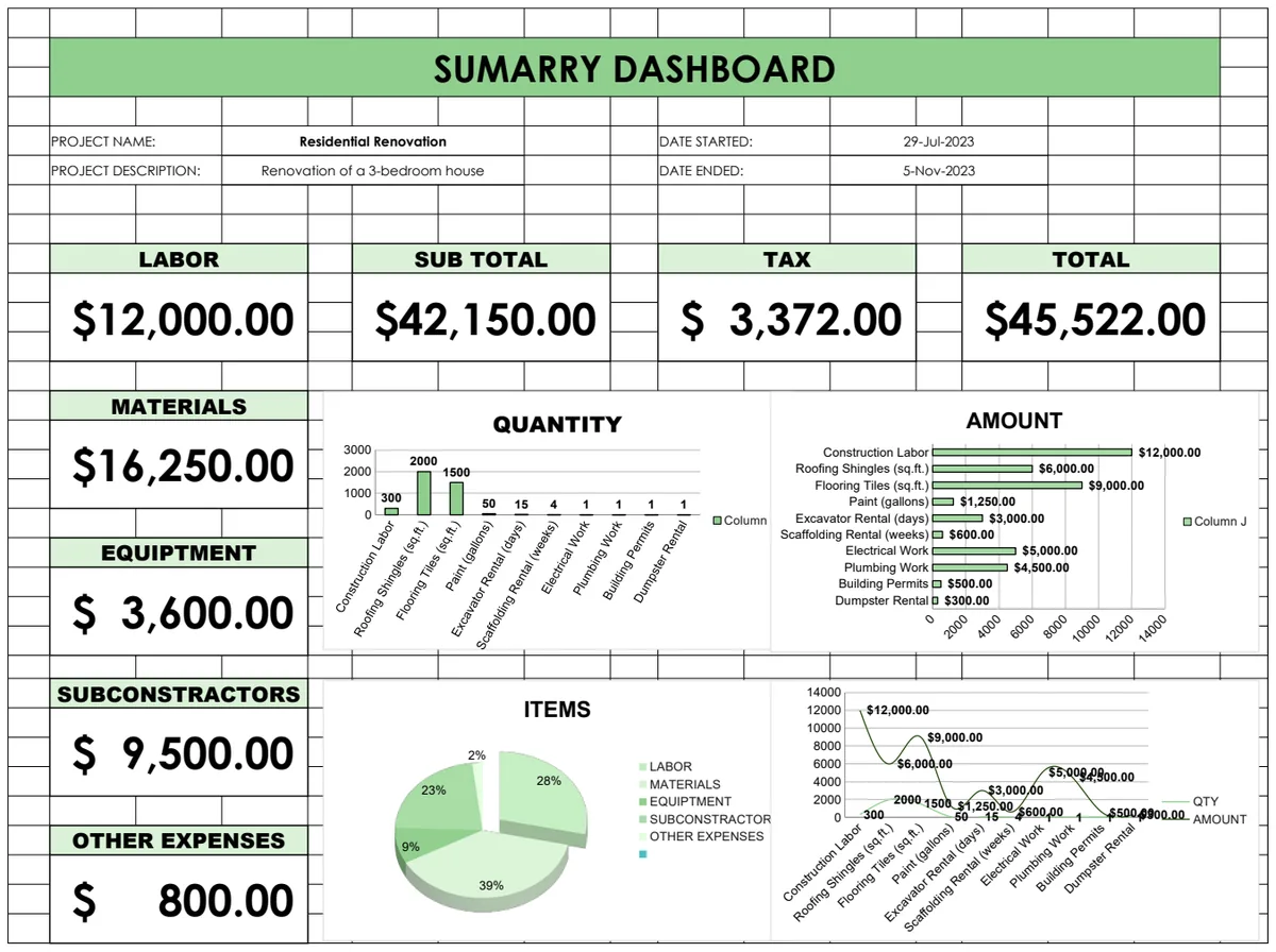
Discover how to build a dynamic Google Sheets dashboard in under 15 minutes to gain actionable insights from your data.
Manually updating spreadsheets for reporting is a drag, but building a dynamic dashboard in Google Sheets can transform your data into actionable insights. The difference between a static report and a live dashboard isn't just presentation; it’s about immediate understanding and faster decision-making. If you're wondering how to create a dashboard in Google Sheets, you're likely looking to move beyond simple tables and charts to a visual summary that updates automatically.
A well-designed dashboard in Google Sheets can serve as your central hub for tracking key performance indicators (KPIs), project statuses, or financial health. It’s about making complex data digestible at a glance. This guide will walk you through the core concepts and practical steps to build one, from data organization to visualization techniques, ensuring you can answer your most pressing questions without endless scrolling.
Structuring Your Dashboard Data
Before you even think about charts, get your data organized. A dashboard is only as good as the data feeding it. For any dashboard, you'll want to separate your raw data from your dashboard elements. This separation is critical for clarity and maintainability.
Imagine you're tracking sales. Your raw data sheet might have columns like:
DateProduct NameCategoryUnits SoldRevenueRegion
Your dashboard sheet, on the other hand, will pull summarized information from this raw data. You won't be putting individual sales entries there. Instead, you'll use formulas to aggregate this data into meaningful metrics. This approach keeps your dashboard sheet clean and focused on presentation, while the raw data sheet handles the heavy lifting of recording every transaction.
Choosing Your Dashboard Metrics
What do you actually need to see? This is the most important question when deciding how to create a dashboard in Google Sheets. Without clear objectives, you'll end up with a cluttered mess of charts that don't tell a story.
Consider the purpose:
- Sales Performance: Total Revenue, Units Sold, Average Order Value, Sales by Region, Top Performing Products.
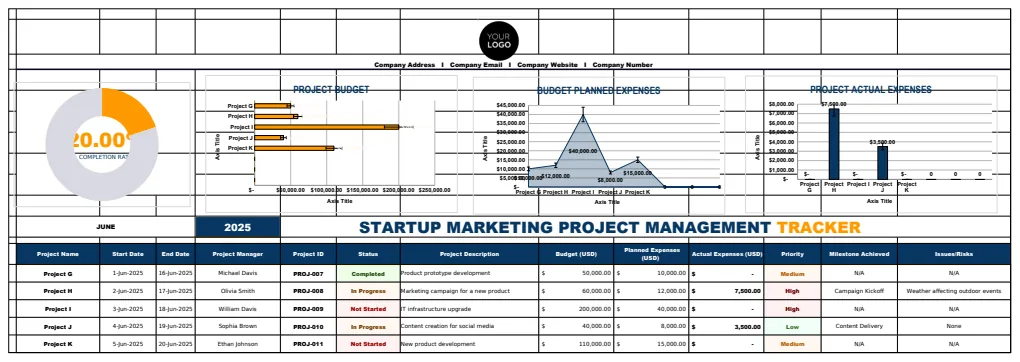
- Project Management: Tasks Completed, Tasks Remaining, Project Timeline Status, Resource Allocation, Budget Burn Rate.
- Marketing Campaign: Website Traffic, Conversion Rates, Social Media Engagement, Cost Per Lead.
For example, if you're managing multiple projects, you might want to see the overall percentage of tasks completed across all projects. This can be calculated using a simple COUNTIF or COUNTIFS formula on your project tracking sheet. If you're tracking revenue by region, you’ll need to sum up revenue figures for each distinct region.
Leveraging Google Sheets Formulas for Aggregation
This is where the magic happens. Google Sheets offers powerful formulas to pull summarized data from your raw tables onto your dashboard sheet.
- `SUMIFS` and `COUNTIFS`: These are your workhorses for conditional aggregation. If you want to know total revenue for a specific
CategoryorRegion,SUMIFSis perfect. For instance,=SUMIFS(RawData!E:E, RawData!C:C, "Electronics", RawData!F:F, "North")would sum revenue from column E where the category in column C is "Electronics" and the region in column F is "North". - `AVERAGEIFS`: Similar to
SUMIFS, but calculates the average. Useful for average order value or average time spent on a task. - `UNIQUE` and `FILTER`: If you need to create lists of unique items (like all your product names or regions) to use in dropdowns or as labels for your charts,
UNIQUEis excellent.FILTERcan then be used in conjunction with other formulas to pull specific data based on those unique lists. - `XLOOKUP`: This is fantastic for pulling specific data points when you have a unique identifier. For instance, if you have a summary table showing monthly sales, and you want to display the sales for a particular month on your dashboard,
XLOOKUPcan grab that figure.
Let's say your raw data is on a sheet named SalesData and your dashboard is on Dashboard. On your Dashboard sheet, in cell B2, you might have a formula to calculate total revenue: =SUM(SalesData!E:E). In cell B3, to get the total units sold: =SUM(SalesData!D:D).
Visualizing Your Data with Charts
Once your aggregated data is ready on the dashboard sheet, it’s time to visualize it. Google Sheets offers a wide array of chart types, and choosing the right one is crucial for effective communication.
- Column Charts: Great for comparing values across categories (e.g., revenue by region, sales by product).
- Line Charts: Ideal for showing trends over time (e.g., monthly revenue, daily website traffic).
- Pie Charts: Use sparingly, best for showing parts of a whole when there are only a few categories (e.g., market share, breakdown of expenses by major category).
- Bar Charts: Similar to column charts but better for long category labels.
- Scatter Plots: Useful for showing the relationship between two numerical variables.
To insert a chart:
- 01Select the aggregated data range on your dashboard sheet that you want to visualize. For instance, if you have a small table showing
Regionin column A andTotal Revenuein column B, select both columns. - 02Go to the menu bar and click
Insert>Chart. - 03Google Sheets will suggest a chart type, but you can change it in the Chart Editor sidebar. Customize titles, axis labels, colors, and data series to make it clear and aesthetically pleasing.
For complex data visualization needs, consider exploring templates like the Excel Chart template, which offers pre-built structures for various reporting scenarios.
Making Your Dashboard Interactive
Interactivity makes your dashboard more powerful. Users can explore data, filter information, and gain deeper insights without needing to adjust formulas.
- Dropdown Lists (Data Validation): Create dropdown menus for users to select specific categories, products, or time periods. You can then use these selections in your
SUMIFS,FILTER, orXLOOKUPformulas. - To create a dropdown: Select the cell where you want the dropdown. Go to
Data>Data validation. Under "Criteria," choose "List from a range" and select the range containing your unique list of items (e.g., a list of product names from another sheet). - Example: If you have a dropdown in
Dashboard!A1to select aRegion, your revenue formula might change from=SUMIFS(SalesData!E:E, SalesData!F:F, "North")to=SUMIFS(SalesData!E:E, SalesData!F:F, Dashboard!A1).
- Slicers: Available for Pivot Tables (which are excellent for summarizing data), slicers provide interactive filtering buttons. If your dashboard relies on pivot tables, slicers can offer a more user-friendly way to filter data than traditional dropdowns.
A well-integrated set of interactive elements can transform a static report into an exploratory tool, particularly useful for something like the HR Budget Dashboard Template, where managers might need to drill down into specific department expenses.
Conditional Formatting for Visual Cues
Conditional formatting can highlight key information directly within your data tables or on your dashboard. This draws attention to performance that meets, exceeds, or falls short of targets.
- Highlighting High/Low Values: You can set rules to color cells based on their value. For example, if you have a list of monthly sales figures, you can highlight cells that are above a certain target in green and those below in red.
- To apply: Select the range of cells. Go to
Format>Conditional formatting. Choose "Color scale" or "Single color" and set your rules (e.g., "Greater than 1000" or "Color scale" for a gradient).
- Data Bars: These are like mini bar charts within cells, providing a quick visual comparison of values in a row or column.
- To apply: In the conditional formatting rules, select "Data bars" and choose a color.
These visual cues can make your dashboard much more intuitive. A quick glance at a series of red cells indicating underperformance can prompt immediate action.
Common Dashboard Mistakes to Avoid
Building your first dashboard, or even your tenth, can lead to missteps. Being aware of common pitfalls can save you a lot of time and frustration.
- Too Much Information: Trying to cram every possible metric onto one screen is overwhelming. Focus on the most critical KPIs that drive your decisions. Less is often more.
- Poor Data Organization: As mentioned earlier, if your raw data is messy, duplicated, or inconsistent, your dashboard will be unreliable. Keep raw data clean and separate.
- Ignoring Your Audience: Who is this dashboard for? A dashboard for executives will look very different from one for a project team. Tailor the metrics and presentation to their needs.
- Outdated Data: If your dashboard isn't updating automatically, it quickly becomes useless. Ensure your formulas are correctly linked to live data sources and that the data is refreshed regularly.
- Cluttered Visualizations: Overusing colors, 3D effects, or complex chart types can obscure the data. Stick to clear, simple, and appropriate chart types.
If you're planning social media posts and need a dashboard to track engagement alongside your plan, a template like the Social Media Posting Plan Template with Dashboard can provide a structured starting point and avoid common planning errors.
Frequently Asked Questions
How often should I update my dashboard?
Ideally, your dashboard should update automatically as new data is entered into your source sheets. If you're manually entering data, establish a regular schedule (daily, weekly) for updates. For critical dashboards, automation is key.
Can I share my Google Sheets dashboard?
Yes, Google Sheets makes sharing easy. You can share it directly with specific people, grant view-only or edit access, or even publish it to the web as a read-only interactive report. This is crucial for team collaboration.
What if my data is in another application, like a CRM?
You can often connect other applications to Google Sheets. Some CRMs have built-in export functions, or you might use tools like Zapier or Google Apps Script to automate data transfer from various sources into your Google Sheet, keeping your dashboard current.
When should I consider a dedicated business intelligence tool instead of Google Sheets?
If your data volume becomes massive (hundreds of thousands or millions of rows), your dashboard needs are highly complex, or you require advanced user management and security features, a dedicated BI tool might be more appropriate. For most small to medium-sized needs, Google Sheets is incredibly capable for how to create a dashboard in Google Sheets.