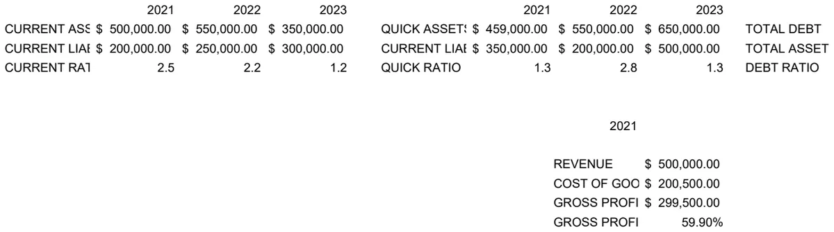
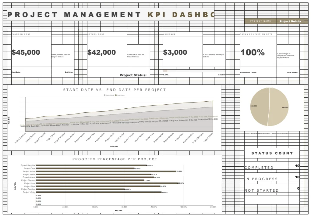
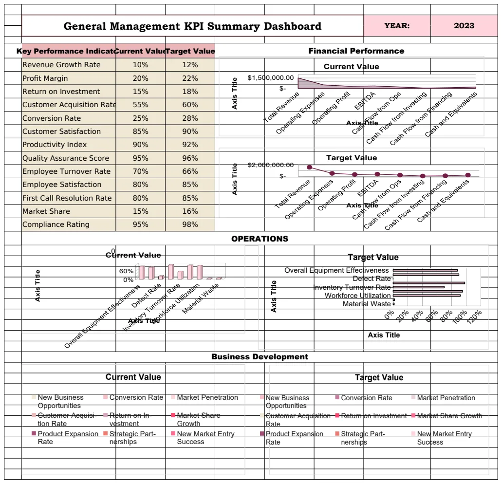
Create a dynamic Google Sheets dashboard in minutes
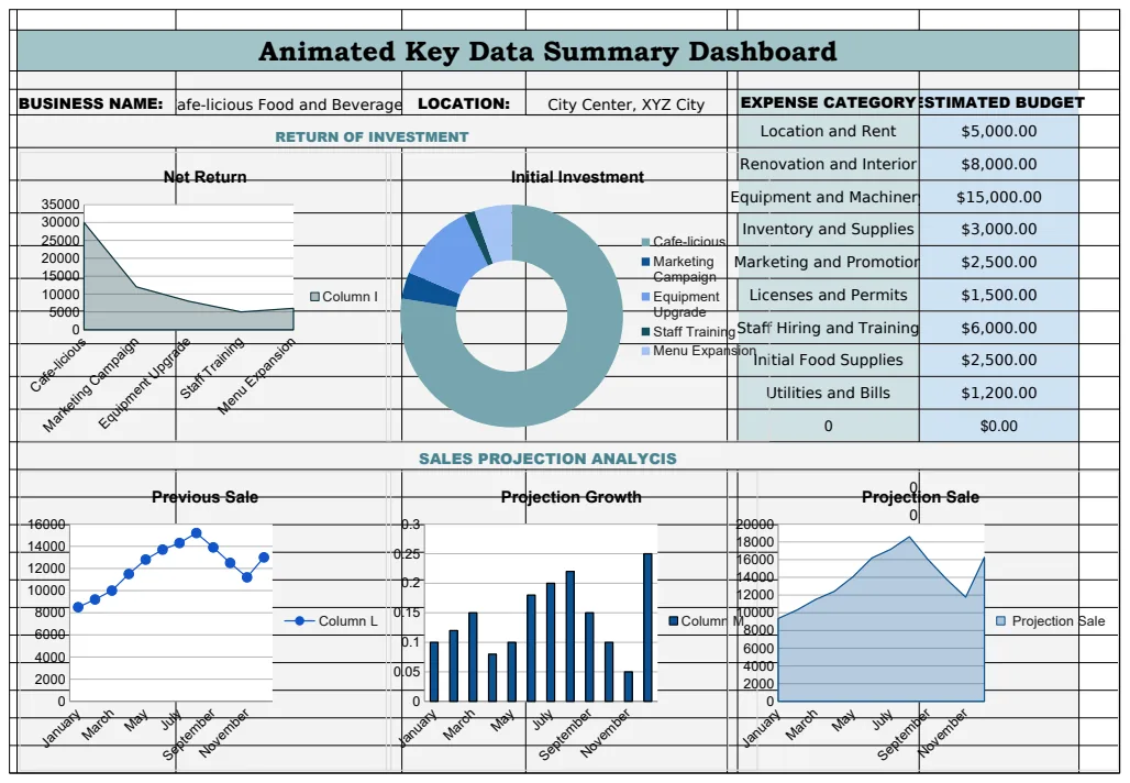
Discover how to create a dynamic Google Sheets dashboard template that updates automatically with your data.
It's a common misconception that a truly dynamic Google Sheets dashboard template requires complex scripting or external tools. In reality, you can build powerful, interactive dashboards using only built-in Google Sheets functions and features, significantly enhancing how you visualize and understand your data. This approach ensures your dashboard automatically updates as your source data changes, providing real-time insights without constant manual intervention.
The core of a dynamic dashboard lies in its ability to react to data shifts. When you're looking for a Google Sheets dashboard template dynamic enough to keep pace with your business, you need systems that don't just display static figures but actively interpret and present trending information. This means setting up your formulas and visualizations so they reference your raw data intelligently, pulling and processing what's needed for clear reporting.
Understanding Dynamic Data Refresh
A dynamic dashboard means the numbers and charts you see aren't fixed snapshots. They're live. When new sales data comes in, for instance, your revenue totals, conversion rates, and profitability charts should adjust automatically. This is achieved by structuring your dashboard sheets to pull data from a separate "raw data" sheet using functions like IMPORTRANGE (if data is from another sheet or spreadsheet), QUERY, FILTER, or even simple cell references. The key is that the dashboard formulas point to the raw data, not the data itself. When the raw data changes, the formulas recalculate, and the dashboard updates.
Consider a scenario where your raw data is in a sheet named "SalesData". Column A might be "Order Date", Column B "Product", Column C "Region", and Column D "Revenue". On your dashboard, you want to show total revenue for the current month. Instead of manually summing, you'd use a formula like:
=SUMIFS(SalesData!D:D, SalesData!A:A, ">="&EOMONTH(TODAY(),-1)+1, SalesData!A:A, "<="&EOMONTH(TODAY(),0))
This formula sums column D (Revenue) where the date in column A (Order Date) is within the current calendar month. As new sales records are added to "SalesData" with today's date, this SUMIFS formula will automatically include them. The dashboard updates instantly. This principle applies to almost any metric you want to track dynamically.
Essential Components of a Dynamic Dashboard
At its heart, a dynamic dashboard in Google Sheets consists of three main parts:
- 01Raw Data Sheet: This is where all your transactional or source data resides. Think of it as your primary ledger. It should be clean, organized, and ideally, updated regularly. For example, your "SalesData" sheet might have columns like "OrderID", "CustomerName", "Product", "Category", "SaleDate", "Quantity", "UnitPrice", "TotalRevenue", "Region", and "Salesperson". The more structured this sheet is, the easier it is to build dynamic reports from it.
- 02Calculation/Aggregation Sheet (Optional but Recommended): For complex dashboards, it's wise to have a dedicated sheet where you perform calculations, summaries, and data transformations. This keeps your raw data clean and your dashboard sheet focused purely on presentation. You might use formulas here like
SUMIFS,AVERAGEIFS,COUNTIFS,UNIQUE,SORT, orARRAYFORMULAto aggregate data for specific periods, products, or regions. For instance, on a sheet named "Aggregations", you could have a table listing each unique product and its total sales for the past quarter. A formula in cell A1 of "Aggregations" might be:
=QUERY(SalesData!B:H, "SELECT B, SUM(H) WHERE B IS NOT NULL GROUP BY B ORDER BY SUM(H) DESC LABEL SUM(H) 'Total Sales'") This extracts unique products from column B, sums their total revenue from column H, and sorts them by sales value. Your dashboard can then simply reference cells from this "Aggregations" sheet.
- 03Dashboard Sheet: This is the visual layer. It contains charts, graphs, key performance indicators (KPIs) displayed in prominent cells, and often interactive elements like dropdowns or date pickers. All visualizations and KPI figures on this sheet should be linked to the data on your raw data sheet or your calculation sheet. For example, a KPI cell might display
=Aggregations!B2to show the top-selling product's name, and another cell might show=Aggregations!C2for its total sales. Charts would then be configured to pull data directly from the "Aggregations" sheet or directly from the "SalesData" sheet usingQUERYorFILTERfunctions within the chart data range.
Building Interactive Controls
Dynamism isn't just about automatic updates; it's also about user interaction. You can add controls that allow users to filter the data displayed on the dashboard without altering underlying formulas.
Dropdown Menus for Filtering
Google Sheets' "Data validation" feature is perfect for creating dropdown lists. You can create a list of unique regions, products, or salespersons on a separate helper sheet. Then, on your dashboard sheet, select a cell (e.g., B1) and go to Data > Data validation. Choose "List from a range" and select the range containing your unique items.
Now, when a user selects a region from this dropdown, you can use formulas like FILTER or QUERY to display data specific to that selection. For example, if your dropdown is in cell B1 on the "Dashboard" sheet, and you want to show revenue by product for the selected region, a formula in your data table for the dashboard might look like this:
=FILTER(Aggregations!A:B, Aggregations!C:C=Dashboard!B1)
(Note: This assumes your "Aggregations" sheet has columns for Product, Total Sales, and Region. If your raw data is directly used, the formula would be more complex, referencing "SalesData".)
Date Range Selectors
For time-based analysis, you can create two cells for users to input start and end dates. Then, modify your SUMIFS, QUERY, or FILTER formulas to use these date cells as criteria.
For instance, if Dashboard!D1 is the start date input and Dashboard!E1 is the end date input, your revenue formula could become:
=SUMIFS(SalesData!D:D, SalesData!A:A, ">="&Dashboard!D1, SalesData!A:A, "<="&Dashboard!E1)
This allows users to define their own reporting periods.
Using QUERY for Complex Filtering
The QUERY function is incredibly versatile for dynamic dashboards. It can filter, sort, aggregate, and pivot data all in one go, responding to external inputs.
Suppose you have a dropdown for "Region" in Dashboard!B1 and a dropdown for "Product Category" in Dashboard!B2. You can use a QUERY on your "Dashboard" sheet to pull aggregated sales data:
=QUERY(SalesData!A:H, "SELECT B, SUM(H) WHERE C = '"&Dashboard!B1&"' AND D = '"&Dashboard!B2&"' GROUP BY B LABEL SUM(H) 'Total Sales'", 1)
This formula selects product (Column B) and sums revenue (Column H) where the region (Column C) matches the selection in Dashboard!B1 and the category (Column D) matches Dashboard!B2. The 1 at the end indicates that the source data has one header row.
Leveraging Charts and Visualizations
Dynamic dashboards are only as good as their ability to communicate insights clearly. Google Sheets offers a wide array of chart types, and making them dynamic is straightforward.
Linking Charts to Dynamic Data Ranges
When you create a chart, Google Sheets asks for a "Data range." Instead of selecting a static range like A1:B10, you can use formulas that output dynamic ranges.
For example, if you want a chart showing monthly sales, and your monthly sales figures are generated by a formula in column F (starting from F2) on your "Aggregations" sheet, you can set your chart's data range to something like:
=Aggregations!E2:F
Here, column E might contain your month labels (e.g., "Jan", "Feb"), and column F contains the corresponding sales figures. As new months are added to your raw data and the aggregation formulas populate column F, the chart automatically extends to include them.
Conditional Formatting for Visual Cues
Beyond charts, use conditional formatting to highlight key data points directly in your tables. For instance, you can set up rules on your "Aggregations" sheet or directly on your dashboard to:
- Color-scale revenue figures to show high and low performers.
- Highlight cells that fall below a certain target threshold (e.g., if actual sales are less than 80% of the target).
- Apply icon sets to indicate performance trends (e.g., an upward arrow for increasing sales, a downward arrow for decreasing sales).
To set this up, select the range you want to format, go to Format > Conditional formatting. Choose a rule type (e.g., "Color scale" or "Single color") and define your criteria. Crucially, ensure your conditional formatting rules reference the same dynamic data ranges or formulas that drive your KPIs and charts.
Common Pitfalls to Avoid
Even with powerful functions, dynamic dashboards can fall short if not built carefully. Here are common mistakes:
- Over-reliance on manual data entry: If your "raw data" sheet requires manual input, the dashboard won't be truly dynamic. Explore options like Google Forms, email attachments processed by scripts, or direct integrations if possible.
- Messy raw data: Inconsistent formatting, blank rows, or duplicate entries in your source data will break formulas like
SUMIFSandQUERY. Clean your data first. UseTRIMto remove extra spaces,CLEANto remove non-printable characters, andUNIQUEto identify duplicates. - Formulas pointing to the wrong places: Double-check your cell references and sheet names. A single typo can render a crucial calculation useless. Use named ranges for critical data points to reduce errors.
- Performance issues: Very large datasets (tens of thousands of rows) combined with complex
ARRAYFORMULAorQUERYfunctions can slow down your sheet. Consider using a dedicated "Calculation" sheet to pre-aggregate data, reducing the load on the dashboard sheet itself. Also, avoid using entire column references (likeA:A) in formulas if only a portion of the column is used; specify a range (likeA2:A1000) instead. - Ignoring error handling: Formulas like
IFERRORcan prevent your dashboard from showing#N/Aor#DIV/0!errors. Wrap critical formulas inIFERRORto display a blank cell or a specific message (e.g., "No Data") when something goes wrong. For instance:=IFERROR(SUMIFS(...), "No Data").
Advanced Techniques and Tips
To push your dynamic dashboard further, consider these advanced strategies:
Using IMPORTRANGE for Cross-Spreadsheet Data
If your source data resides in a different Google Sheet, IMPORTRANGE is your best friend. It allows you to pull data from one spreadsheet into another.
=IMPORTRANGE("spreadsheet_url_or_id", "SheetName!Range")
For example, if your sales data is in a separate "Sales Database" sheet, you'd use:
=IMPORTRANGE("https://docs.google.com/spreadsheets/d/1AbCdEfGhIjKlMnOpQrStUvWxYz0123456789", "SalesData!A:H")
Remember that the first time you use IMPORTRANGE, you'll need to grant permission for the sheets to connect. For dynamic dashboards, ensure the "SheetName!Range" part of the formula is also dynamic if needed, perhaps by using INDIRECT combined with other functions, though this can become complex and impact performance.
Creating Custom Functions with Apps Script
For highly specific logic or integrations not covered by built-in functions, Google Apps Script allows you to write custom JavaScript functions. You can create a function that fetches data from an external API, performs complex calculations, or formats data in a unique way.
For example, a custom function getMarketPrice(tickerSymbol) could fetch the current stock price for a given ticker. You would then use it in a cell like:
=getMarketPrice("GOOG")
These custom functions can be used just like built-in ones within your dashboard.
Pre-aggregating Data with QUERY on a Hidden Sheet
To optimize performance on very large datasets, consider creating a hidden sheet (or a sheet named something like "Calculation Engine") where you use QUERY to pre-aggregate all necessary data. Then, your main dashboard sheet simply pulls from this pre-aggregated data. This reduces the number of complex calculations that need to run every time the sheet recalculates.
For instance, on a hidden sheet, you might have a QUERY that aggregates sales by month and region for the last 12 months. Your dashboard then just references specific cells or a small table from this hidden sheet.
Using Google Data Studio (Looker Studio) for Larger-Scale Dashboards
While Google Sheets is excellent for many dynamic dashboard needs, if you're dealing with massive datasets, multiple data sources, or require more sophisticated interactive features and visualizations, consider connecting your Google Sheets data to Google Data Studio (now Looker Studio). It's a free tool designed specifically for dashboard creation and offers more powerful features for data exploration and reporting. Your Google Sheet acts as the data source, and Looker Studio handles the visualization and interactivity.
Tracking Changes Over Time with UNIQUE and FILTER
To show trends or changes, you can use UNIQUE to get a list of distinct items (e.g., unique customers, unique products) and then use FILTER or SUMIFS to pull their associated data over time.
For example, to see the sales trend for each unique product:
- 01On a "Helper" sheet, in cell
A1, get unique products:=UNIQUE(SalesData!B:B) - 02On the "Dashboard" sheet, set up columns for "Product", "Total Sales This Month", "Total Sales Last Month".
- 03In the "Product" column of your dashboard table, reference your unique list:
=Helper!A1and drag down. - 04In the "Total Sales This Month" column, use a formula like:
=SUMIFS(SalesData!D:D, SalesData!B:B, A2, SalesData!A:A, ">="&EOMONTH(TODAY(),-1)+1, SalesData!A:A, "<="&EOMONTH(TODAY(),0))(assuming A2 is the product name). Drag this down. - 05Similarly, create a formula for "Total Sales Last Month" using date criteria for the previous month.
This allows you to see how each product's performance changes month-over-month directly on your dashboard.
Handling Blank Cells in Formulas
When aggregating data, blank cells can sometimes cause issues or be counted unintentionally. Using IF or IFERROR can help. For example, to sum revenue but ignore rows where revenue is blank:
=SUMIFS(SalesData!D:D, SalesData!A:A, ">="&DATE(2023,1,1), SalesData!A:A, "<="&DATE(2023,1,31), SalesData!D:D, ">0")
The ">0" condition ensures only positive revenue figures are summed, effectively ignoring blanks or zero values in the revenue column.
How to Effectively Use FILTER with Multiple Criteria
The FILTER function is excellent for pulling subsets of data. To combine multiple criteria, you can multiply boolean (TRUE/FALSE) conditions.
Let's say you want to filter sales data for a specific region in Dashboard!B1 and for sales made after a certain date in Dashboard!D1. Your formula might look like:
=FILTER(SalesData!A:H, (SalesData!C:C=Dashboard!B1) * (SalesData!A:A>=Dashboard!D1))
The * acts as an "AND" operator. Both conditions must be TRUE for a row to be included. If you wanted an "OR" condition, you would use + instead, but this requires careful management of the output range.
Example: Building a Sales Performance Tracker
Let's walk through building a simple dynamic sales tracker.
Data Structure:
- Sheet: "SalesData"
- Column A: OrderDate (e.g.,
1/15/2024) - Column B: Product (e.g.,
Widget A) - Column C: Region (e.g.,
North) - Column D: Revenue (e.g.,
150.00)
- Sheet: "Dashboard"
- Cell
B1: Dropdown for Region (Data validation, List from range:=UNIQUE(SalesData!C:C)) - Cell
B2: Dropdown for Product (Data validation, List from range:=UNIQUE(SalesData!B:B)) - Cell
B3: Input for Start Date - Cell
B4: Input for End Date - Cell
B5: Total Revenue for Selected Criteria - Cell
B6: Number of Orders for Selected Criteria - Cell
B7: Average Order Value for Selected Criteria
Formulas for the Dashboard:
- 01Total Revenue (Cell B5):
=IFERROR(SUMIFS(SalesData!D:D, SalesData!C:C, B1, SalesData!B:B, B2, SalesData!A:A, ">="&B3, SalesData!A:A, "<="&B4), 0) This sums revenue, filtering by Region (B1), Product (B2), and the date range (B3:B4). IFERROR handles cases where no data matches, returning 0.
- 02Number of Orders (Cell B6):
=IFERROR(COUNTIFS(SalesData!C:C, B1, SalesData!B:B, B2, SalesData!A:A, ">="&B3, SalesData!A:A, "<="&B4), 0) This counts the number of orders matching the same criteria.
- 03Average Order Value (Cell B7):
=IFERROR(B5/B6, 0) This divides Total Revenue by the Number of Orders. If the number of orders is 0, it returns 0 to avoid a #DIV/0! error.
Making it More Dynamic:
- Chart: Create a chart (e.g., a bar chart) to show revenue by product for the selected region and date range. The data range for this chart could be generated using
QUERY:
=QUERY(SalesData!A:D, "SELECT B, SUM(D) WHERE C='"&B1&"' AND A>="&TEXT(B3,"yyyy-mm-dd")&" AND A<="&TEXT(B4,"yyyy-mm-dd")&" GROUP BY B LABEL SUM(D) 'Revenue'", 1) This formula dynamically generates a table of products and their total revenue based on your selections, which you can then use as the data source for your chart.
This structured approach ensures that as your "SalesData" sheet is updated, and as you change the selections in B1:B4 on the "Dashboard" sheet, cells B5, B6, B7, and the underlying chart will all update automatically.