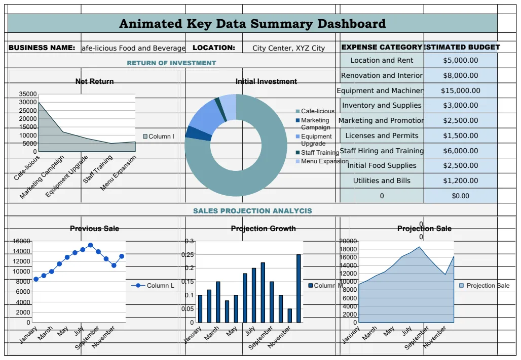
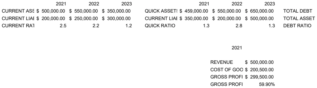
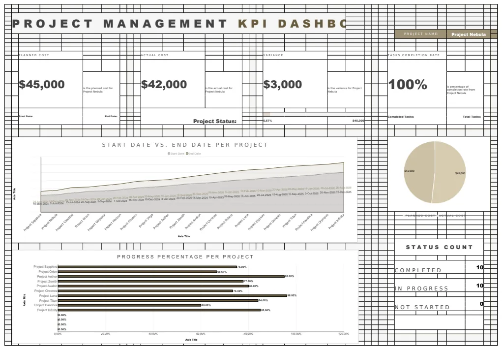
Unlock deeper insights with this interactive Excel dashboard
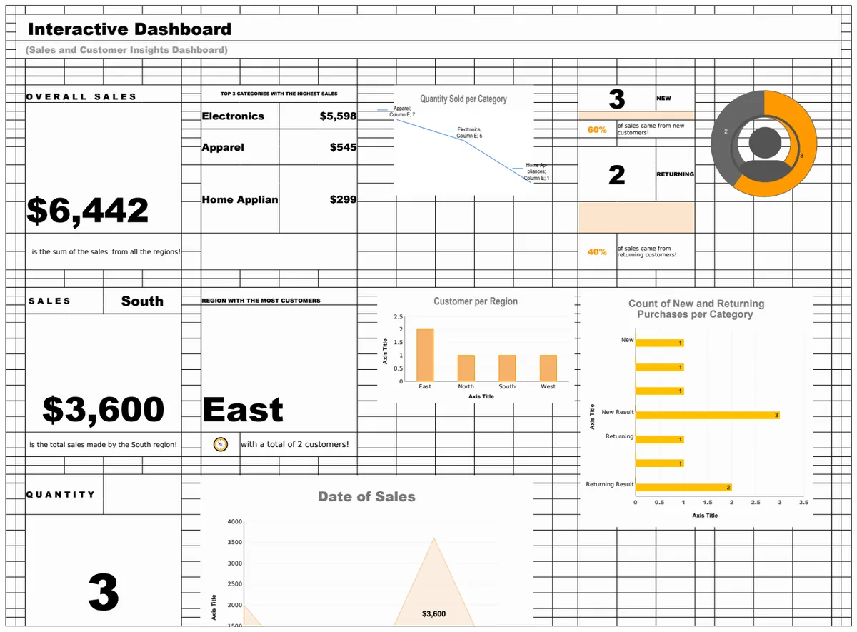
Discover how to transform your unwieldy spreadsheets into powerful, interactive Excel dashboard templates for dynamic reporting.
The moment you realize your spreadsheet is becoming unmanageable is usually when you need to filter data by multiple criteria simultaneously, or when you want to visualize trends but the static charts just aren't cutting it. This happens because spreadsheets, while powerful for data entry and basic calculations, can quickly become unwieldy for complex analysis and dynamic reporting without the right structure. Building an effective interactive Excel dashboard template requires a deliberate approach to data organization and the smart application of Excel's features.
You're not just looking for pretty charts; you're aiming for a tool that lets you drill down into your data, spot anomalies, and communicate insights clearly to others. This means your underlying data needs to be structured for analysis, and your dashboard elements need to be linked intelligently. Think of it like building a custom control panel for your business or project, where each dial and gauge provides immediate, actionable information based on real-time inputs.
Structuring Your Data for Interactivity
The foundation of any good dashboard, interactive or otherwise, is clean, well-organized data. If your raw data is a mess, your dashboard will be too. Here’s how to prepare it:
- 01Consistent Formatting: Ensure all your data is in a tabular format. Each column should represent a single data field (e.g., "Date," "Product Name," "Sales Amount," "Region"). Avoid merged cells within your data range, as they can break many Excel functions.
- 02Excel Tables are Your Friend: Convert your raw data range into an Excel Table (Insert > Table or
Ctrl+T). This is crucial. Tables automatically expand as you add new data, and they give your data a structured name, making formulas more readable and dynamic. For example, instead of=SUM(C2:C100), you might have=SUM(SalesTable[Sales Amount]). - 03Unique Identifiers: For certain analyses, having unique identifiers for each record or item can be helpful, though not always strictly necessary for basic dashboarding.
- 04Date Formatting: Ensure all date columns are formatted as dates. This allows Excel to correctly group and sort data by day, week, month, or year. Incorrect formatting (e.g., dates as text) will break time-series analysis.
Key Dashboard Components and Their Construction
An interactive dashboard typically combines several elements to provide a holistic view.
Dynamic Charts
Charts are the visual heart of your dashboard. To make them interactive, you'll often pair them with Slicers or Timeline Slicers.
- Slicers: These are visual filter buttons. Once you've created an Excel Table and inserted a PivotTable or PivotChart based on that table, you can add Slicers (PivotTable Analyze > Insert Slicer). Clicking a Slicer button instantly filters the associated PivotTable and PivotChart. You can connect a single Slicer to multiple PivotTables if you have them.
- Timeline Slicers: Specifically for date fields, these offer a visual slider to select date ranges. They work best with data structured as Excel Tables and PivotTables.
- Formulas for Dynamic Ranges: For non-PivotChart-based charts, you can use formulas like
OFFSETandCOUNTAwithin the chart's data source definition to make the chart range automatically adjust as your data grows. However, this is more complex and prone to error than using PivotCharts with Slicers.
Key Performance Indicators (KPIs)
KPIs are single-cell metrics that show critical performance data, like total sales, average order value, or conversion rate.
- PivotTables: The easiest way to generate dynamic KPIs is through PivotTables. Create a PivotTable from your Excel Table, drag the relevant fields into the "Values" area (e.g., "Sales Amount" for Sum of Sales), and then extract the Grand Total or specific subtotals to display on your dashboard sheet.
- SUMIFS/COUNTIFS/AVERAGEIFS: For more direct calculation without PivotTables, these functions are invaluable. For example,
=SUMIFS(SalesTable[Sales Amount], SalesTable[Region], "North", SalesTable[Product Category], "Widgets")calculates the total sales for "Widgets" in the "North" region. You can link these formulas to cells containing your Slicer selections (if you're not using PivotTables directly) or dropdown menus.
Tables for Detail Views
Sometimes, you need to show a snapshot of the underlying data, filtered dynamically.
- PivotTables: Again, PivotTables are excellent for this. You can configure a PivotTable to display detailed rows and columns, and then use Slicers to filter the view.
- Dynamic Array Formulas (Excel 365): If you have Excel 365, functions like
FILTERare game-changers. For instance,=FILTER(SalesTable, (SalesTable[Region]="North") * (SalesTable[Product Category]="Widgets"))will spill a table of all sales records matching those criteria. This is a powerful way to create a dynamic detail table on your dashboard.
Building Your First Interactive Dashboard: A Walkthrough
Let's imagine you're tracking sales data and want an interactive Excel dashboard template to see performance by region and product.
Scenario: You have a sheet named "RawSalesData" with columns: Date, Region, Product, Sales Amount, Units Sold.
Steps:
- 01Format as Table: Go to your "RawSalesData" sheet. Select all your data (or just a cell within it) and press
Ctrl+T. Name this table "SalesData" in the "Table Design" tab. - 02Create a Dashboard Sheet: Add a new sheet and name it "Dashboard".
- 03Insert PivotTable for KPIs:
- On the "Dashboard" sheet, go to Insert > PivotTable.
- Choose "Use an external data source" if your data is not on the same workbook, or select your "SalesData" table.
- Select "Existing Worksheet" and choose a cell on your "Dashboard" sheet (e.g., A1).
- In the PivotTable Fields pane, drag
Sales Amountto the "Values" area (it should default to "Sum of Sales Amount"). DragRegionto the "Rows" area. This gives you total sales by region.
- 04Insert PivotChart for Sales by Region:
- Click anywhere inside your newly created PivotTable.
- Go to PivotTable Analyze > PivotChart.
- Choose a "Column" chart. Click OK.
- Move this chart to your "Dashboard" sheet. Resize and position it.
- 05Insert Slicers:
- Click inside your PivotTable again.
- Go to PivotTable Analyze > Insert Slicer.
- Check the boxes for
RegionandProduct. Click OK. - Position these Slicers on your "Dashboard" sheet.
- 06Connect Slicers to All Relevant PivotTables:
- Right-click on the "Region" Slicer. Select "Report Connections...".
- Check the box for your "SalesData" PivotTable. Click OK.
- Repeat for the "Product" Slicer.
- (Advanced: If you create other PivotTables for different KPIs, like Total Units Sold, you'd come back here and connect these Slicers to those PivotTables as well.)
- 07Add a KPI Cell:
- On your "Dashboard" sheet, in a cell above your chart (e.g., E1), type "Total Sales:".
- In the cell next to it (F1), enter the formula:
=GETPIVOTDATA("Sum of Sales Amount",PivotTable!$A$1)(assuming your PivotTable starts at A1 on a sheet named "PivotTable"). This formula dynamically pulls the grand total sales from your PivotTable, which will update as you filter with Slicers.
- 08Add a Dynamic Detail Table (Excel 365):
- In a different area of your "Dashboard" sheet, type headers:
Date,Region,Product,Sales Amount. - In the cell below the
Dateheader, enter theFILTERformula. For example, to show sales for the "North" region:=FILTER(SalesData, SalesData[Region]="North"). This will spill the relevant data. You can link the criteria ("North") to a cell with a dropdown or even the Slicer's output if you're feeling adventurous.
Now, when you click on a region or a product in the Slicers, your chart, KPI, and detail table will all update instantly.
Common Pitfalls to Avoid
- Unstructured Data: The most common mistake is not formatting your source data as an Excel Table. This leads to broken formulas and charts that don't update automatically.
- Merged Cells: Avoid merging cells in your data source or on your dashboard sheet where dynamic elements are expected to interact.
- Over-Complication: Don't try to cram too much information onto one sheet. A dashboard should provide a high-level overview with the ability to drill down, not a dense report.
- Ignoring PivotTable Cache: When you insert a PivotTable, Excel creates a cache. If you don't refresh it, your dashboard might show old data. Right-click the PivotTable and select "Refresh," or go to Data > Refresh All.
- Hardcoding Numbers: Never type numbers directly into formulas on your dashboard that should be pulling from your data (e.g., total sales, counts). Use PivotTables or dynamic formulas like
SUMIFSorGETPIVOTDATA.
Frequently Asked Questions
Can I make a dashboard that updates automatically without clicking "Refresh All"?
Yes, to some extent. If your data source is an Excel Table on the same workbook, PivotTables and charts linked to it will update when you interact with Slicers or filters. For external data sources, or if you're updating the raw data file itself, you might need to set up data connections that refresh automatically when the file is opened or on a timed interval (Data > Get & Transform Data > Connection Properties).
What's the difference between using PivotTables and formulas like SUMIFS for KPIs?
PivotTables are generally easier for beginners and offer built-in aggregation and filtering capabilities, especially when combined with Slicers. Formulas like SUMIFS offer more direct control and can be more performant for very large datasets if optimized correctly, but they require manual setup for each KPI and don't inherently offer interactive filtering without additional complex linking. For a typical interactive dashboard, PivotTables are often the preferred starting point.
How can I share my interactive dashboard with others?
You can share your Excel file directly. However, recipients will need to have Excel installed. For wider sharing or if you want to avoid users accidentally altering your formulas, you can save your dashboard as a PDF. Be aware that PDFs are static, so the interactivity will be lost. If you need a truly web-based, collaborative solution, you might consider cloud platforms like Power BI or Google Data Studio, though these have different learning curves and data connection methods.
Are there ready-made templates I can use or adapt?
Absolutely. Using a pre-built interactive Excel dashboard template can save you a significant amount of time and provide a solid structure to learn from. For instance, a template like the Interactive Sales and Customer Insights Dashboard offers pre-configured charts, Slicers, and KPI calculations that you can adapt to your specific data. Similarly, a Purchase Order Dashboard Template or an Analytics Data Dashboard can provide a strong starting point for different business needs. Many templates are available with a one-time purchase for unlimited downloads.