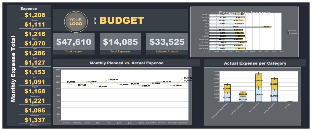
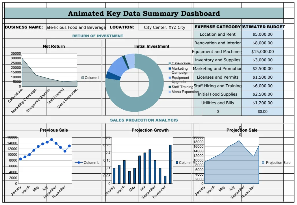
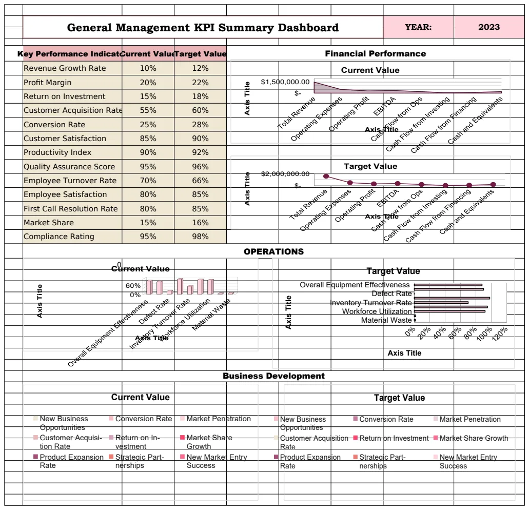
Sales dashboard template in Excel, ready for download.
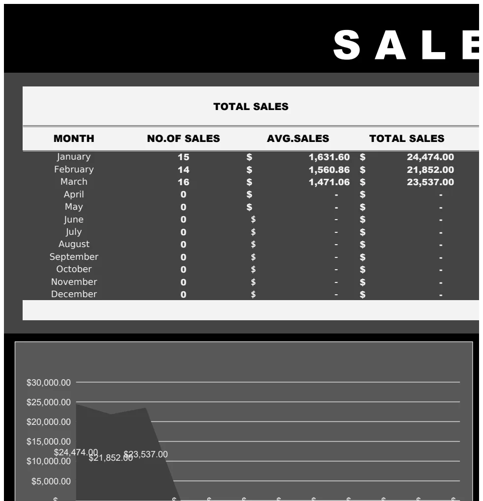
Discover a powerful sales dashboard template in Excel, designed to transform your raw data into clear, actionable business insights.
That specific SUMIFS formula, often overlooked in basic setups, is your secret weapon for aggregating sales data by region, product, or salesperson. Without it, you're stuck with manual lookups or clunky VLOOKUPs that break easily. If you're searching for a sales dashboard template Excel free download, you're likely trying to get a clearer, real-time picture of your business performance without reinventing the wheel. A well-structured template can turn raw transaction data into actionable insights, showing you what's selling, who's selling it, and where your biggest opportunities lie.
The challenge with many free templates is their rigidity. They might track sales, but they don't always adapt to your specific business model or the metrics you actually care about. You need a dashboard that doesn't just show data, but helps you understand it. This means looking for templates that offer flexibility in filtering, sorting, and visualizing information, allowing you to drill down into specific periods, products, or customer segments.
Key Metrics Your Sales Dashboard Must Track
At a minimum, any sales dashboard worth its salt should provide a clear view of these core metrics. Don't get bogged down in vanity numbers; focus on what directly impacts your bottom line.
- Total Revenue: The most fundamental metric. This should be broken down by period (daily, weekly, monthly, quarterly, annually) to show trends.
- Units Sold: Complementary to revenue, this shows volume and can highlight pricing effectiveness.
- Average Deal Size: Calculated as Total Revenue / Number of Deals. This tells you if you're closing larger deals or more smaller ones.
- Sales Growth Rate: Compares current period sales to a previous period. This is crucial for understanding momentum.
- Conversion Rate: If your template tracks leads or opportunities, this is vital. It's the percentage of leads that become paying customers.
- Sales by Product/Service: Understand which offerings are driving revenue and volume.
- Sales by Region/Territory: Identify top-performing geographical areas.
- Sales by Salesperson: Measure individual performance and identify coaching opportunities.
- Customer Acquisition Cost (CAC): If you have marketing spend data, tracking CAC alongside new customer revenue is essential.
Building Your Own Dashboard vs. Using a Template
While you can certainly build a sales dashboard from scratch, it’s a significant undertaking. You'll need to:
- 01Structure your raw data: This usually involves a transactional sheet with columns like
Date,Product Name,Customer Name,Salesperson,Quantity,Price,Total Sale Amount,Region. - 02Create summary sheets: Use pivot tables or formulas like
SUMIFS,COUNTIFS, andAVERAGEIFSto aggregate data based on your desired metrics. - 03Design the dashboard sheet: This is where you'll place charts, key performance indicators (KPIs) presented in clear cells, slicers, and timeline controls.
For most users, especially those looking for a sales dashboard template Excel free download, starting with a pre-built template is far more efficient. A good template provides a solid foundation, and you can then customize it to fit your exact needs. This saves hours of setup and ensures you're not missing critical components.
Essential Components of a Flexible Sales Dashboard Template
When evaluating a template, look for these features that allow for customization and deeper analysis.
- Clear Data Input Sheet: A dedicated sheet where you can easily input new sales data without altering the dashboard's formulas or formatting. Columns should be clearly labeled and consistently formatted.
- Pivot Tables for Aggregation: Templates that use pivot tables are inherently more flexible. You can easily drag and drop fields to analyze data from different angles.
- Dynamic Charts: Charts that automatically update as your data changes are a must. Look for line charts for trends, bar charts for comparisons, and pie charts for proportional representation.
- Slicers and Timelines: These interactive filters allow users to quickly narrow down data to specific months, quarters, products, or salespeople without complex formula adjustments.
- KPI Cards: Prominent display of key metrics, often with comparison to previous periods (e.g., "This Month vs. Last Month").
- Conditional Formatting: Used to highlight sales that meet certain criteria (e.g., sales over a target amount, underperforming regions).
Sample Template Structure: The "Sales Dashboard Template"
If you're looking for a robust starting point, the Sales Dashboard Template is designed to handle complex sales tracking. It typically includes a dedicated Transactions sheet where you log every sale. This sheet might have columns like:
Transaction IDDateSalespersonCustomer IDProduct CategoryProduct NameQuantity SoldUnit PriceTotal Sale ValueRegionCommission RateCommission Earned
The template then uses pivot tables connected to this Transactions sheet to populate charts and summary tables on the Dashboard sheet. You can easily add new salespeople or products to the source data, and the pivot tables will pick them up, updating the dashboard automatically. This makes it a powerful tool for anyone needing to track performance across multiple dimensions.
Common Mistakes When Using Sales Dashboards
Even with a great template, users can make errors that diminish its value. Avoid these pitfalls:
- Inconsistent Data Entry: If your raw data is messy (e.g., "Apple" vs. "apple" for a product name, or inconsistent date formats), your dashboard will be inaccurate.
- Over-complication: Trying to cram too many metrics onto one screen makes it hard to read and understand. Focus on the most critical KPIs.
- Outdated Data: A dashboard is only useful if the data is current. Establish a routine for updating your raw data regularly.
- Ignoring Trends: Focusing only on absolute numbers without looking at trends over time can lead to missed opportunities or unaddressed problems.
- Lack of Context: Presenting numbers without comparison (e.g., to targets, previous periods, or industry benchmarks) limits their actionable value.
When to Consider More Advanced Solutions
While a free Excel template can be incredibly effective, there are times when you might outgrow it. If your sales volume becomes massive, or you need advanced features like CRM integration, automated lead scoring, or complex forecasting, you might look at dedicated CRM software or business intelligence tools. However, for most small to medium-sized businesses, a well-configured spreadsheet dashboard is more than sufficient.
For instance, if you're tracking proposals and want to understand conversion rates by individual sales rep, the Sales Proposal Conversion Rate Dashboard Template offers specialized insights into that specific part of the sales funnel. Similarly, if resource allocation is your main concern, a Sales Resource Planning Dashboard Template can visually map out team capacity and assignments.
What if I have data in multiple sources?
If your sales data is scattered across different systems (e.g., online sales platform, in-person POS, spreadsheet invoices), the first step is to consolidate it. You can either manually import data from each source into your template's raw data sheet, or explore tools that can automate this data aggregation. For complex multi-source situations, a template like the Interactive Sales and Customer Insights Dashboard might offer more advanced pivot table capabilities to help you slice and dice consolidated data effectively.
How often should I update my dashboard?
The ideal frequency depends on your business cycle. For fast-moving sales environments, daily updates are best to catch trends in real-time. For businesses with longer sales cycles or less frequent transactions, weekly or even monthly updates might suffice. The key is consistency; choose a schedule you can stick to.
Can I add custom metrics to a template?
Absolutely. Most well-designed templates allow for customization. If you need to track a metric not included, such as "Customer Lifetime Value" or "Average Time to Close," you can often add new columns to your raw data sheet and then create new pivot tables or formulas on your dashboard sheet to calculate and display it. This is where the flexibility of Excel truly shines.
Is there a cost to using these templates?
Many excellent sales dashboard template Excel free download options exist. At OpenWorksheet, you can access a wide library of templates, including those for sales, for a one-time fee of $9, granting unlimited downloads. This provides a cost-effective way to get professional-grade tools that save you significant time and effort compared to building them yourself.